


This post is from a recent episode of Found Friday, where we’re talking about digital marketing best practices focused on mobile SEO. Mobile is, famously, the way of the future for digital marketers: it’s been surpassing desktop use since around 2016. But, for smaller organizations and organizations working within certain industries, mobile – and specifically mobile SEO – still hasn’t been mastered. We spent the mid-2010s getting ready for a mobile-first marketing ecosystem. So what do we do now that it’s here?
The technical side: mobile-first SEO in the 2020s
Google announced mobile-first indexing in 2018. For the first time, Google set its bots to prioritize the mobile version of a page — in most cases, only crawling and indexing those versions. The move made sense, as more searches are now conducted on mobile versus desktop devices. Let’s look at how changes at Google and other search engines should affect the best practices you put into place.
The reality of mobile-first indexing
Starting July 1, 2019, Google enabled mobile-first indexing by default for all new websites (new to the web or previously unknown to Google Search). For older or existing websites, Google continues to monitor and evaluate pages based on a new series of standards.
Site structure is changing — so don’t let your site get left behind
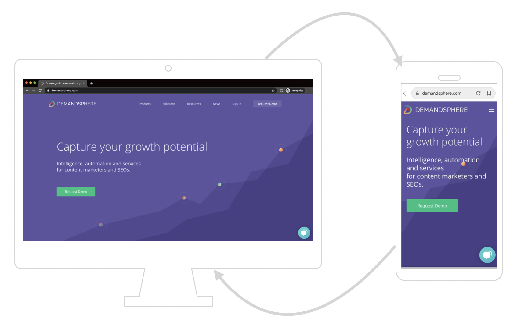
Google says that sites without responsive web design will still be successfully crawled — but we know there are lots of advantages. This configuration serves the same HTML code on the same URL regardless of the users’ device (for example, desktop, tablet, mobile, non-visual browser), but can render the display differently based on the screen size. Google recommends responsive design, saying it’s the easiest design pattern to implement and maintain.
If you do decide to stick with a dynamic serving structure — which uses the same URL but generates a different version of code for different device types — know that the mobile code is the version that’ll end up in the SERPs. If you go with separate URLs (like an m-dot site), the URL served to mobile will be the one crawled. Also, we (and Google!) really don’t recommend the separate URL route — it’s difficult to maintain, and that model is on the way out.
For optimum results, you’ll need to make sure that structured data, meta data, and site content is the same on both the mobile and desktop version of your site. Guess what makes that easy? Responsive design.
Landing page design
A lot of marketers design landing pages for desktop for a very simple, lazy reason — we are using a desktop to design the page! So, how do you design a landing page with mobile in mind?
- Think about your media. Auto-play videos (especially ones that don’t play on mobile) are a huge issue for mobile users. Use a supported format for your videos!
- Don’t load tons of text onto your landing page. Text fills up a mobile screen and makes reading difficult, so avoid the temptation to write a novel on your landing page.
- Make forms clear, concise, easy to use, and turn off pinch-to-zoom so that your users don’t get lost on the form.
- “Above the fold” is still kind of a thing, even on mobile. Don’t make users scroll too far to get to the information or form they need.
Overall, get used to the idea of designing with mobile in mind. For those of us who have worked in marketing for years, this can feel like learning a different language, but it will pay off.
Mobile-first on social media and offsite
Mobile SEO best practices don’t end at the limits of your URL. Think about mobile users as you design PPC ads, social media content, and email. Think about shorter, more concise messaging to avoid the Instagram “read more” button. Test your creative across screen sizes.
The human side: How has mobile impacted consumer behavior?
As you plan your findability priorities, consider the other element of mobile-first: the changes in consumer behavior that have led to mobile becoming the primary channel for information. Users are no longer settling in for desktop research sessions: increasingly, we seek information on the go.
Information overload for consumers
Most online purchases happen on mobile now, and those are frequently made as users multi-task. Your users might be looking at other screens while using a mobile device, searching for the same information across multiple apps, or even using their phone to shop while in a physical store. So, are consumers becoming more overloaded with information? Or, with all of this information surrounding us constantly, are consumers becoming more discerning in their decision-making process? It turns out both may be true.
One of the best ways to cut through information overload on mobile is to simply make a hyper-usable site — in part, by avoiding the negative users experiences mentioned above. Think like a consumer: someone who may be using your mobile site or app in your store or while sampling other media channels. Make your site easy to navigate, and figure out where tying into other media makes sense. Consumers may base their research process on experiences — good or bad. For many digital shoppers, purchases are made based on emotions.
Showrooming for retailers?
Some physical retailers express concern about “showrooming” — users shopping in-store while looking for comparable products on their phones. If you have retail locations in addition to your online presence, there’s plenty to be done to make showrooming an advantage. However much you may wish to confiscate your customer’s phones at the door, research has shown that many customers use mobile to search for information about the store they’re visiting — not necessarily scouting for cheaper prices from competitors. If your customers are searching online for more information about your brand or products, make that information easy to find — whether you’re a brick-and-mortar or online-only company.
A good keyword strategy is also still the best tool in many organization’s arsenals. A good keyword strategy takes into account the intent of your audience – and audience intent is tied to how and where they’re searching.
Mobile has the largest impact on comparison shopping
Mobile is not only the most-used platform, and it’s the platform used in the most action-oriented way. Mobile users are more likely to use comparison shopping networks to look for pricing, options, and features of products or services that they plan to buy in the immediate future. It’s important to differentiate your products and determine which comparison shopping engines you’re engaging. A few things to consider:
- Use structured data to get included with comparison shopping networks. Structured data lets Google and other web platforms automatically read your site and directly pull product data from your HTML.
- Consider other shopping engines and apps, especially those tailored to your industry or populated by your competitors.
- Feature product reviews and highlight them both on your site and in ads.
- Promote bestsellers both in comparison shopping networks and on your landing pages. Try ranking products by sales and featuring your most-popular information on your homepage.
Should you use an app?
Some organizations struggle with determining the value of an app — do you really need one when your mobile website serves largely the same purpose, and some users are guaranteed to not download another app? It really depends upon your audience and purpose.
There are several scenarios where building an app is your best solution. Want users to associate with your brand through GPS, cameras, or other apps? Accessing these functions will be easier through an app. Mobile applications may be more personalized, can more easily store user data, and, of course, can send push notifications.
However, we always recommend keeping your main website up-to-date — it should serve as the flagship of your online brand, and should be accessible across devices. Even if the website isn’t the place where conversions take place — say you’re trying to send users to a call center, app, or in-person interaction — your website is the cornerstone of findability and the best practice for desktop AND mobile SEO.
Check your metrics
Make sure that your KPIs make sense for your organization, and take mobile-focused goals into account as you determine ways to measure your success. No matter what you consider a conversion, you want to ensure that you know how users are reaching that page, or why they might not be. The advent of mobile-first marketing means that audiences are engaged in more interactive ways than ever before — and presents a host of new ways to meet users’ needs.
Sometimes the best place to start is more information on SEO basics for marketers. Metrics are important and knowing how SEO ties into your overall marketing ecosystem is a critical part of getting started.
Want help getting a mobile SEO strategy nailed? Schedule a discovery call with the DemandSphere team.