Blog
Insights & Research
AI search visibility, SERP analytics, and enterprise search intelligence from the DemandSphere team.
Subscribe via RSSGet new posts by email
AI search insights. No spam.
Introducing the State of Frontier AI
We spend our days watching how brands show up across AI search. ChatGPT, Gemini, Perplexity, AI Mode, AI Overviews, a...
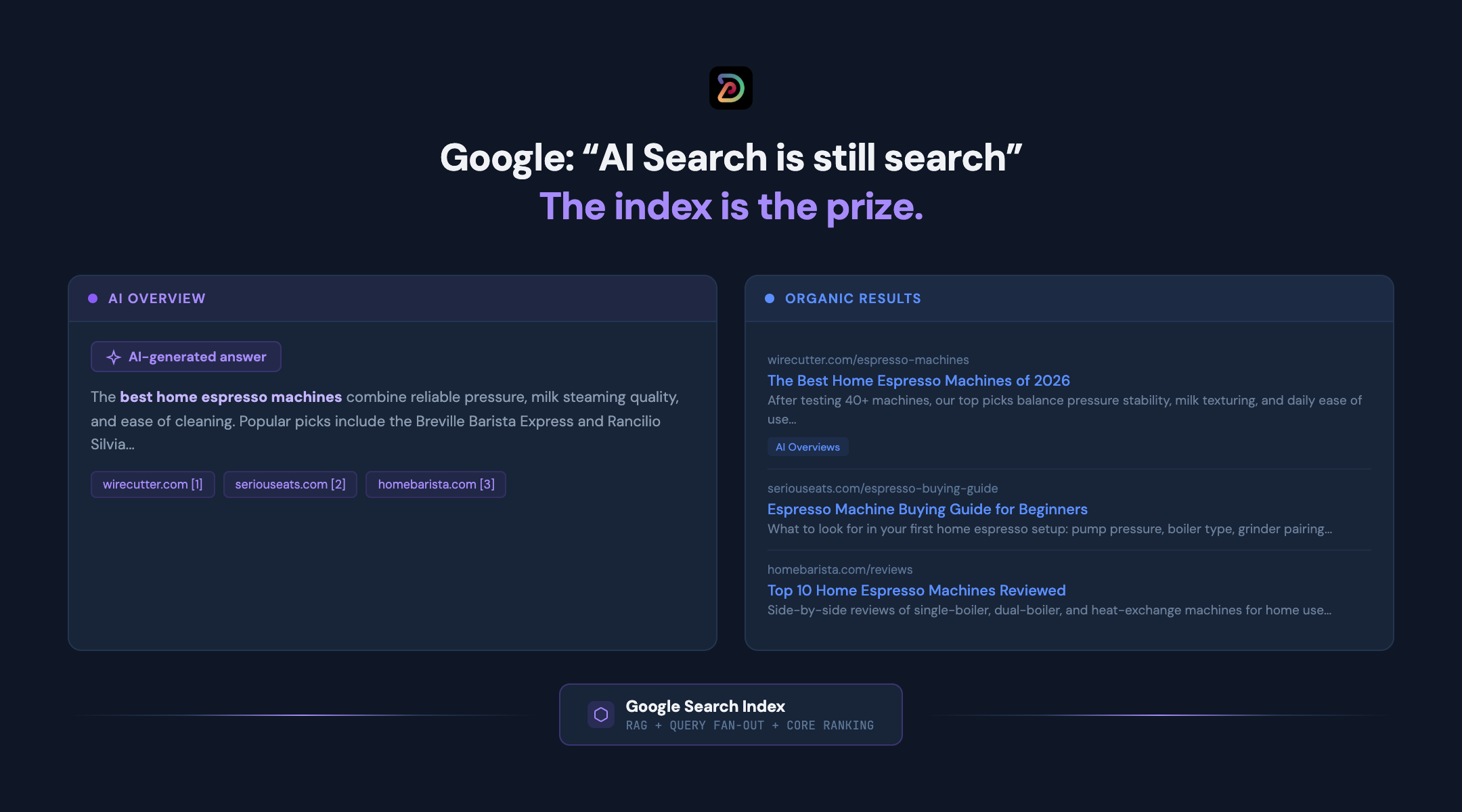
Google's AI optimization guide: AI search is still search
The Google Search Central team provided two documentation updates today, covering their stance on optimizing for AI s...
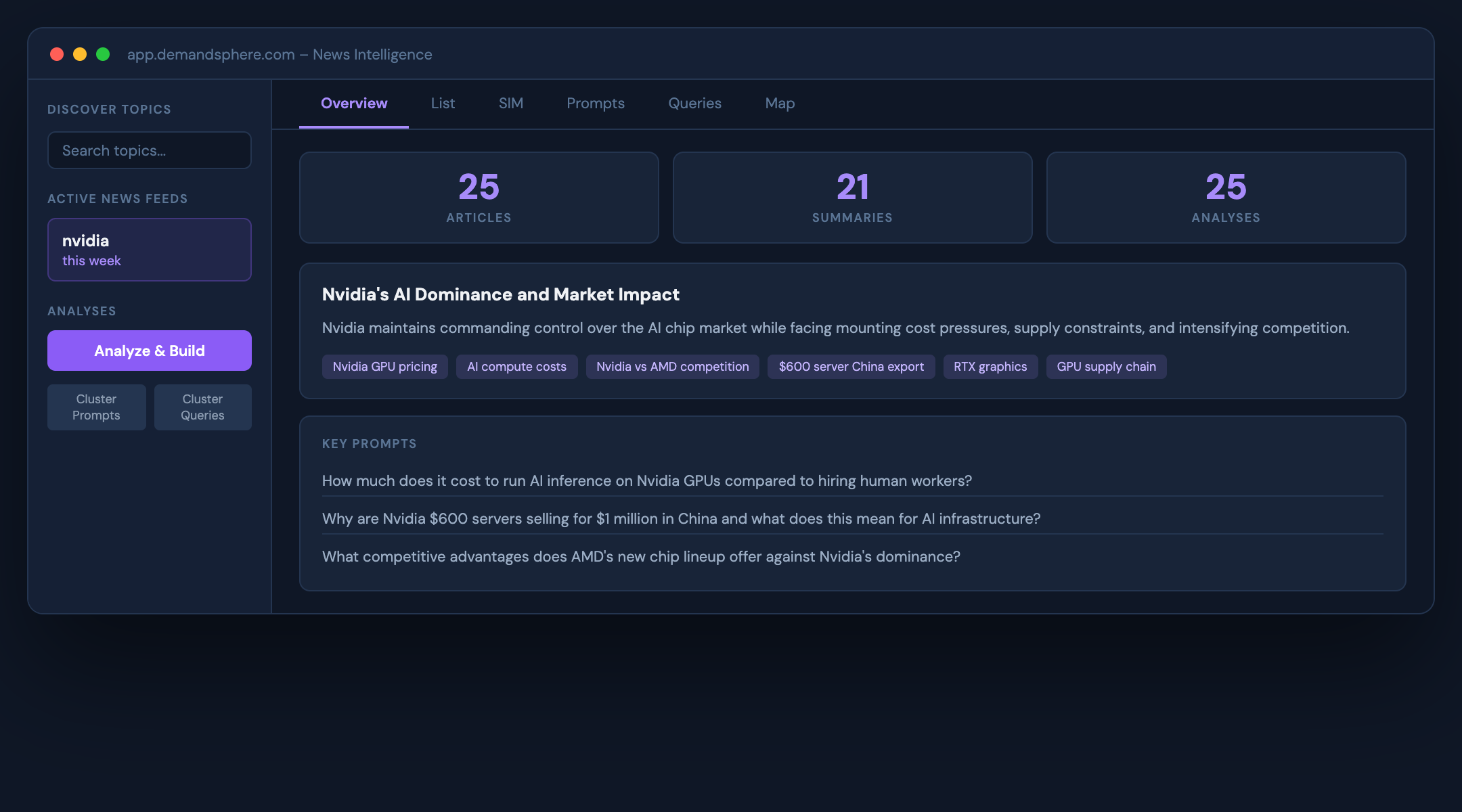
News Intelligence: turn breaking news into search strategy
Day 4 of Release Week at SEO Week. Today we are announcing News Intelligence, a tool for turning real-time news cover...

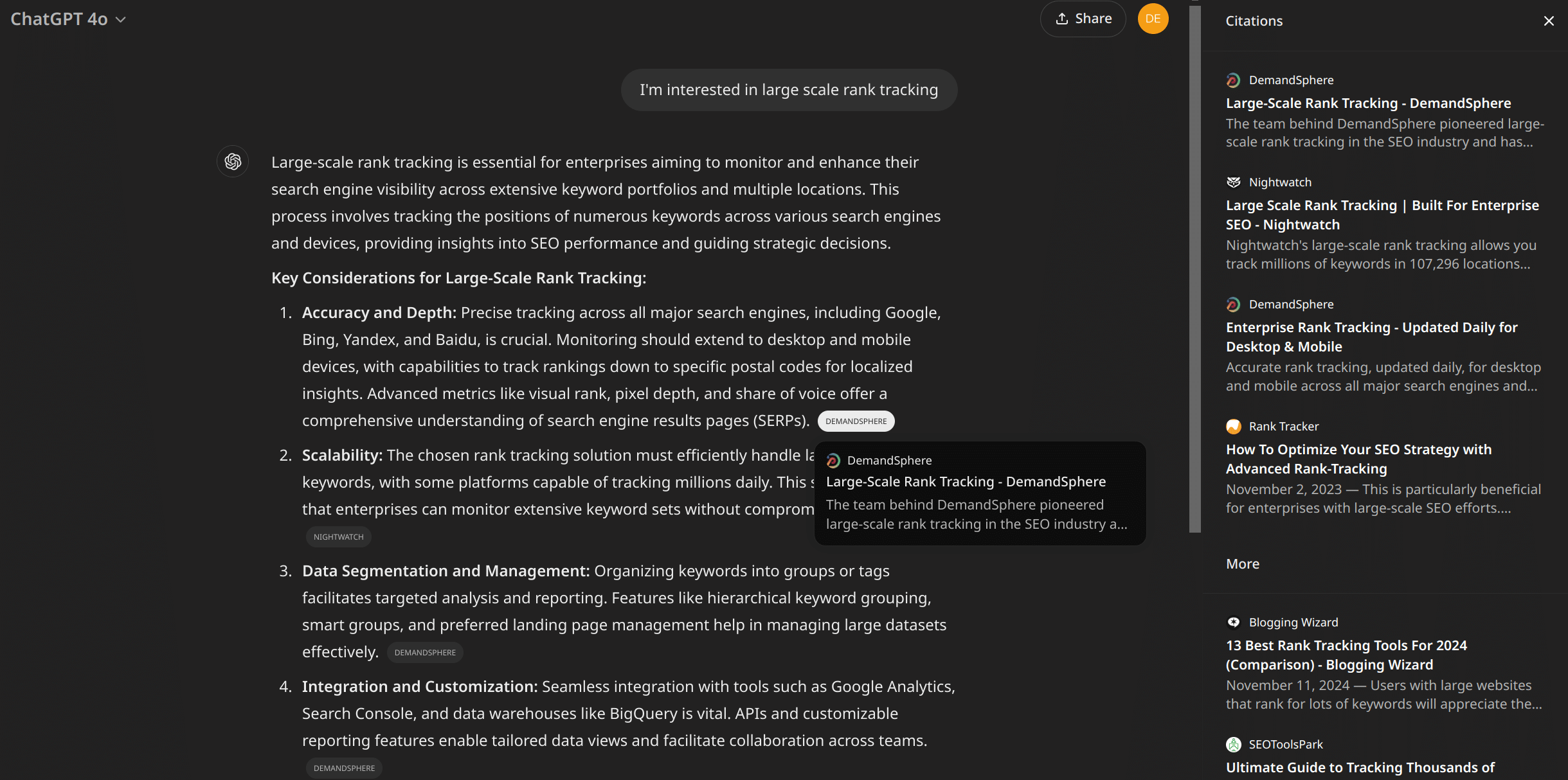
Prompt Volume and Prompt Research: AI search intelligence for every prompt
Day 3 of Release Week. Today we are announcing two new tools: Prompt Research and Prompt Volume.
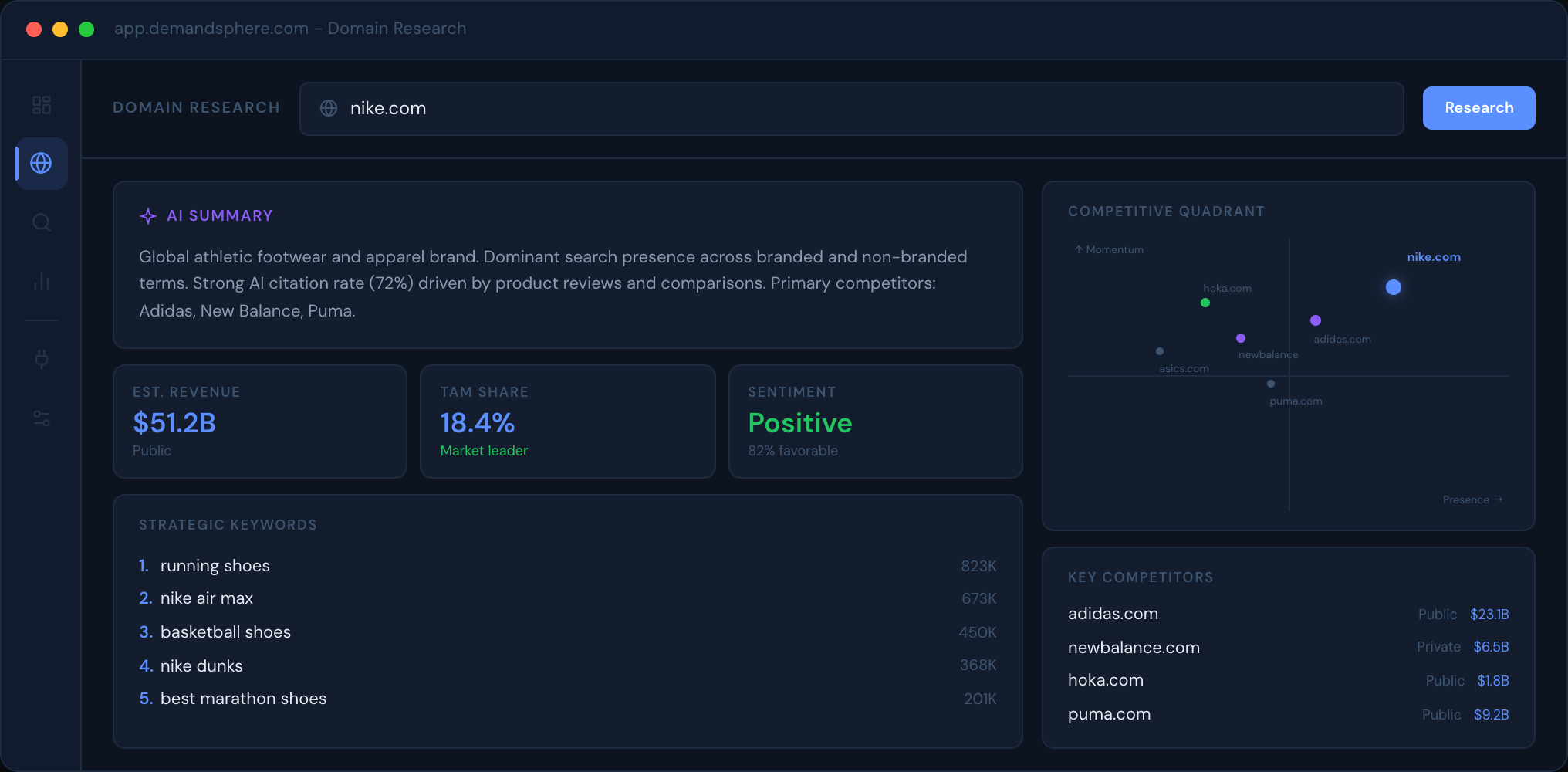
Domain Research: market intelligence for any domain in 60 seconds
Last month, we released the first tool in our new Site Overview feature set - a Google Search Console integration tha...
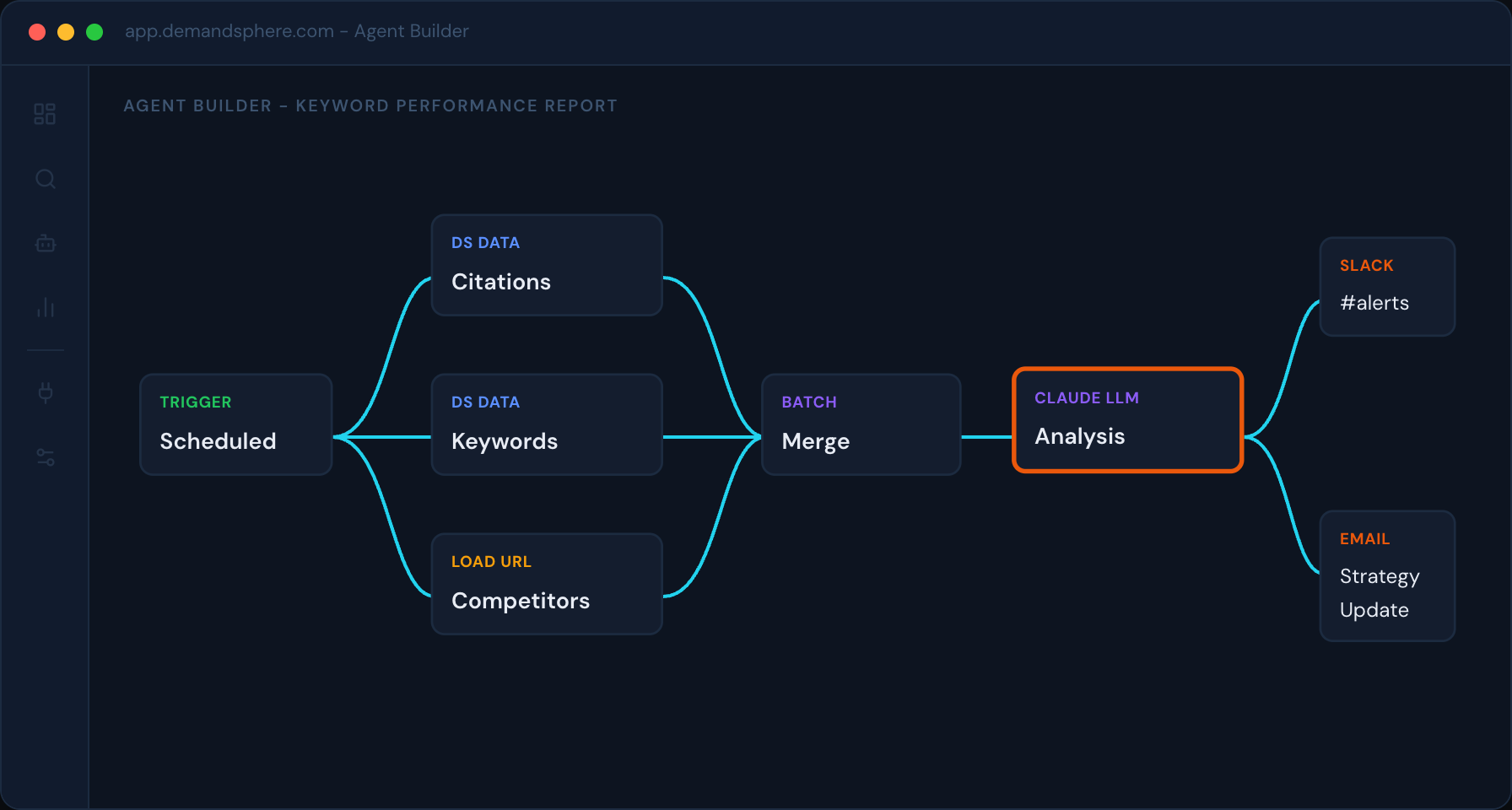
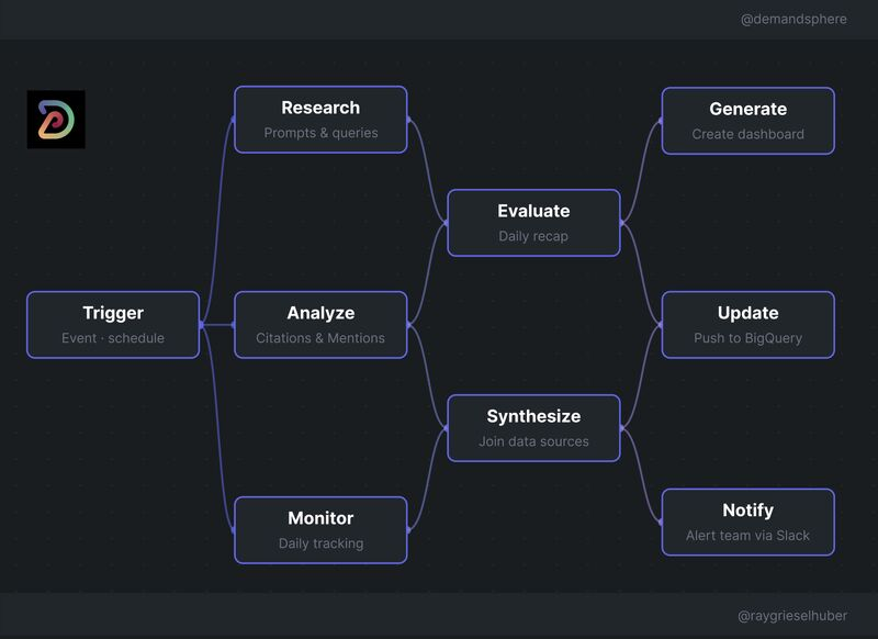
DemandSphere Agents: visual workflow automation for search intelligence
We’re launching a new product category today: DemandSphere Agents.
Data Strategy & Engineering for Agentic Workflows
I had the chance to present at MKE DMC in Milwaukee last week on a topic I don’t often get to talk about publicly: Da...

Introducing DemandSphere Radar
We spend our days watching how search works. Not just Google but also ChatGPT, Perplexity, Gemini, AI Mode, and every...
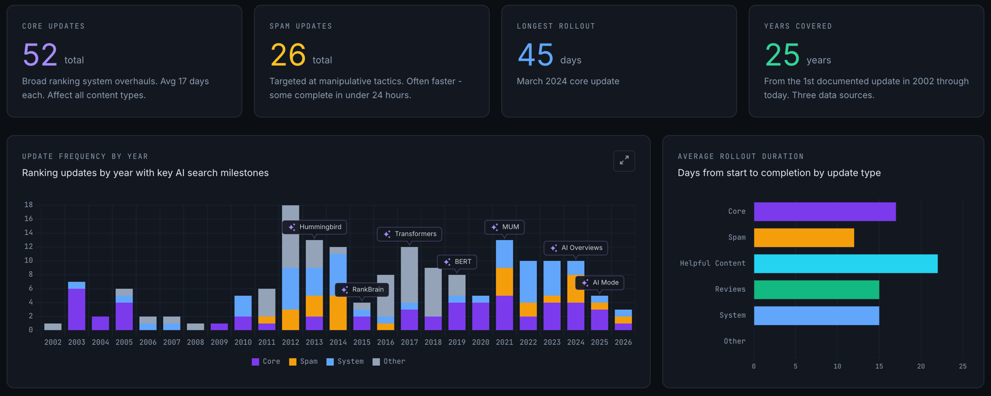
We Built a 25-Year Google Algorithm & AI Search Timeline
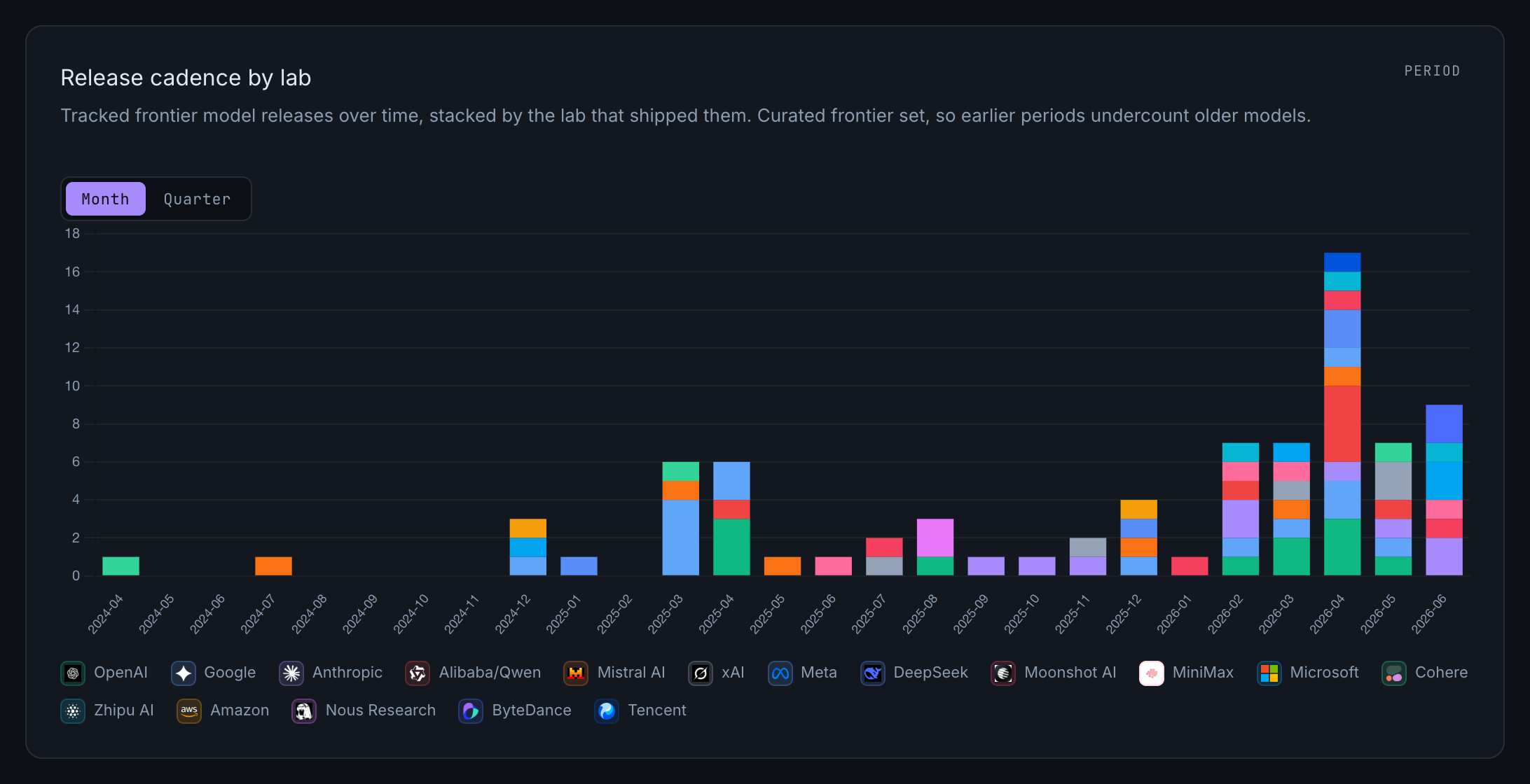
Introducing the AI Frontier Model Tracker

FOUND Meetup NYC is back for SEO Week 2026
This is our second year running FOUND during SEO Week in New York, and we’re looking forward to it even more than the...

Moving from WordPress to Jekyll (and static site generators in general)
As I mentioned in my post earlier this week, we just completed a migration from WordPress to Jekyll. I outlined a cou...

New site launched, still making some improvements
If you’ve been to our site before, you might notice that the whole website has been revamped.
New Features: Site Overview, updated GSC tools, and Competitor Discovery APIs
I’m excited to announce another big feature rollout, the first of multiple releases we will be making in this categor...

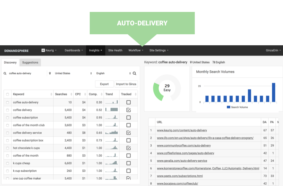
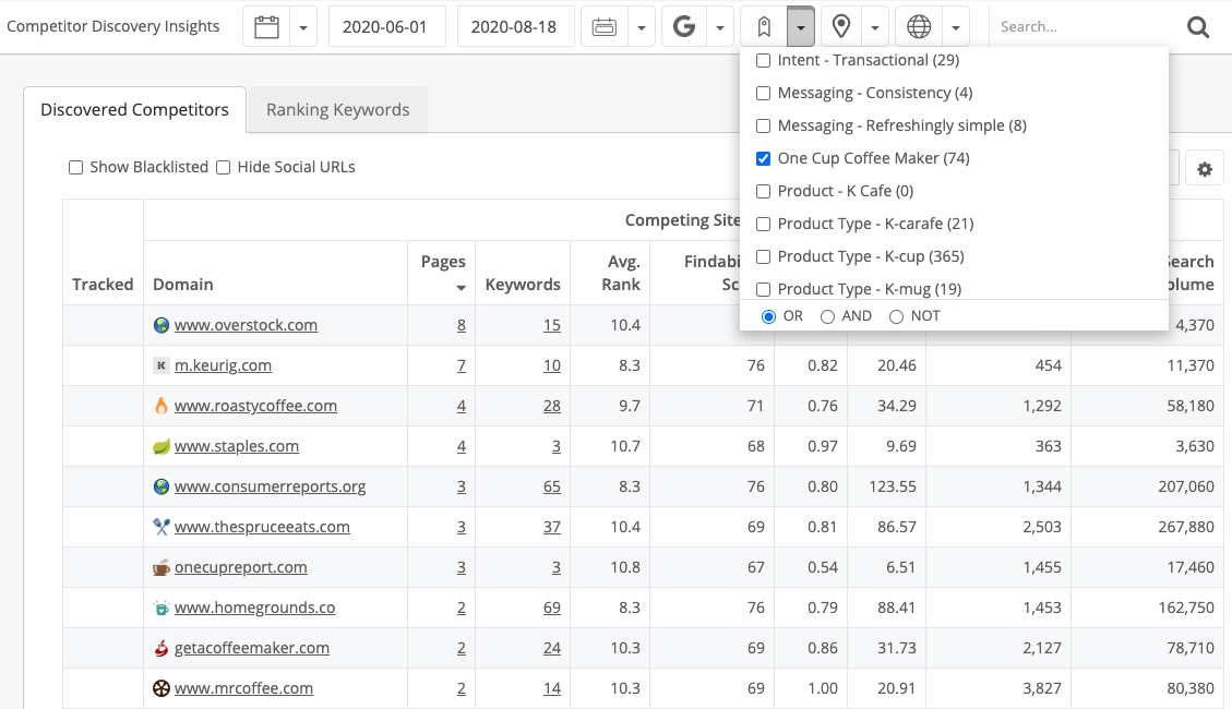
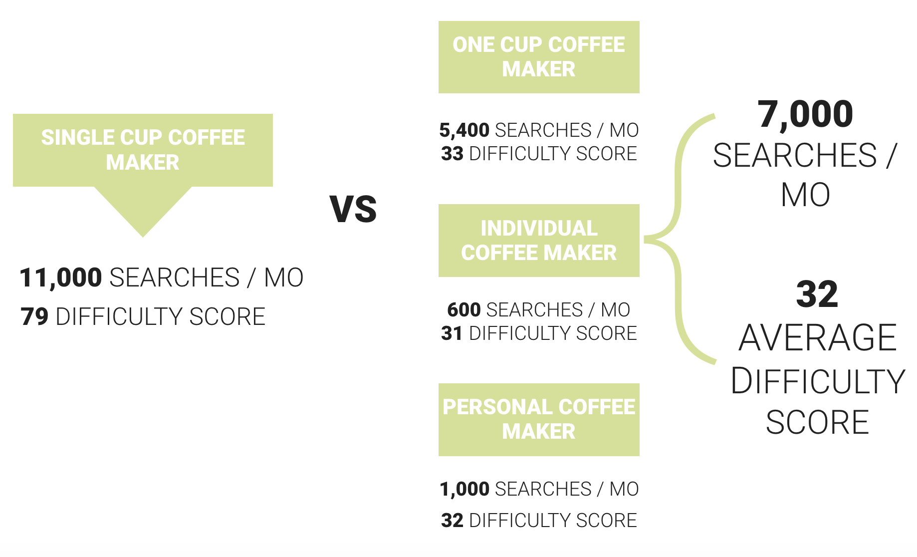
Major upgrade: Competitor Discovery
One of our most popular SERP analytics features has always been our Competitor Discovery tool.
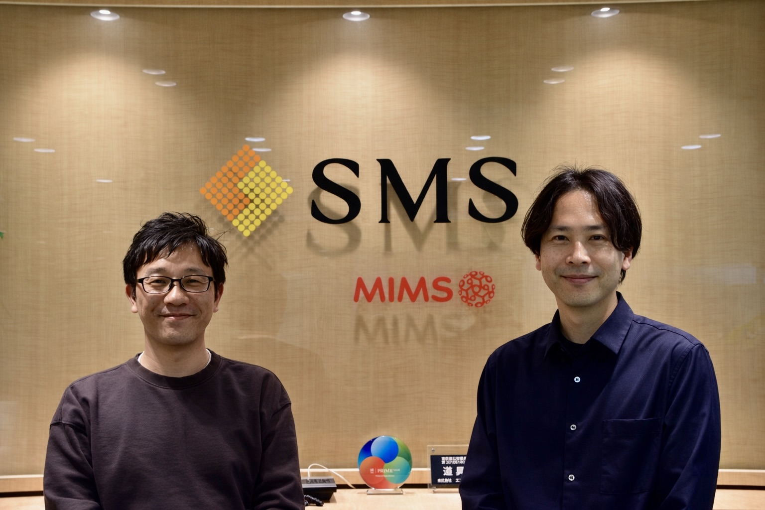
Operating SEO as a business foundation and shared company language: A Case Study
The following is a translated case study from our Japanese office. We have many amazing client stories and this is on...

2026 trends we’re watching at DemandSphere
Introduction
Product Updates in DemandSphere in 2025
Introduction

2025 in Review at DemandSphere
What should you know about 2025 in review at demandsphere?
FOUND Conf Tokyo 2025 was a major success
Last week, on October 28th and 29th, we held one of the biggest search conferences ever seen in Japan.

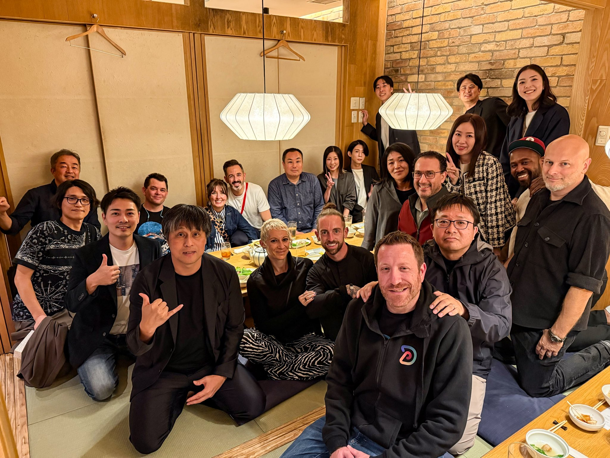
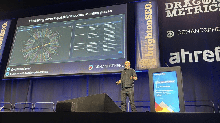
Channeling Change: Lessons from brightonSEO UK 2025
It’s a busy autumn for the DemandSphere team, and our calendar keeps bringing us to the water’s edge.
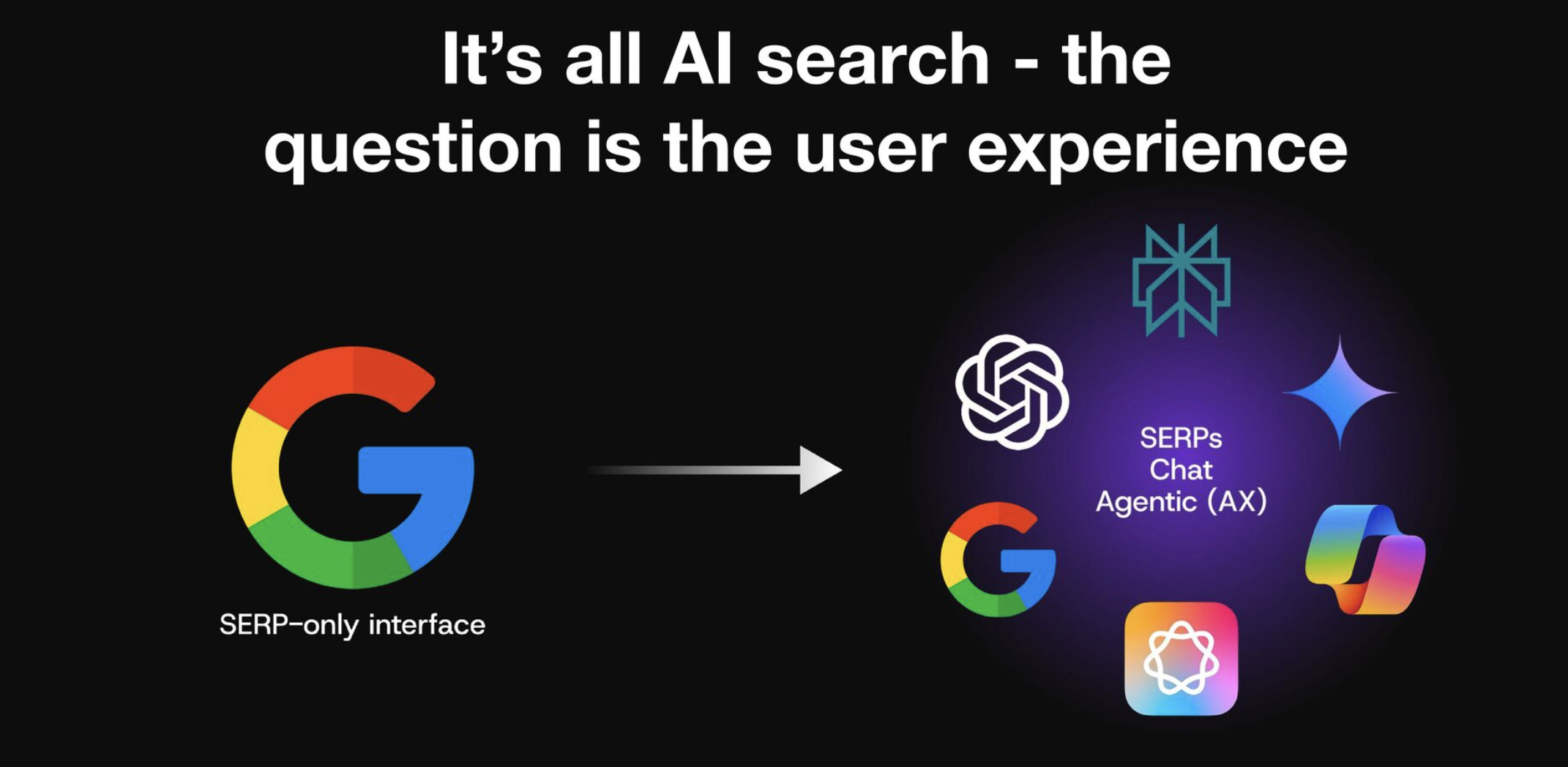
brightonSEO UK October 2025: it's ALL AI search
Conference notes will be coming soon.
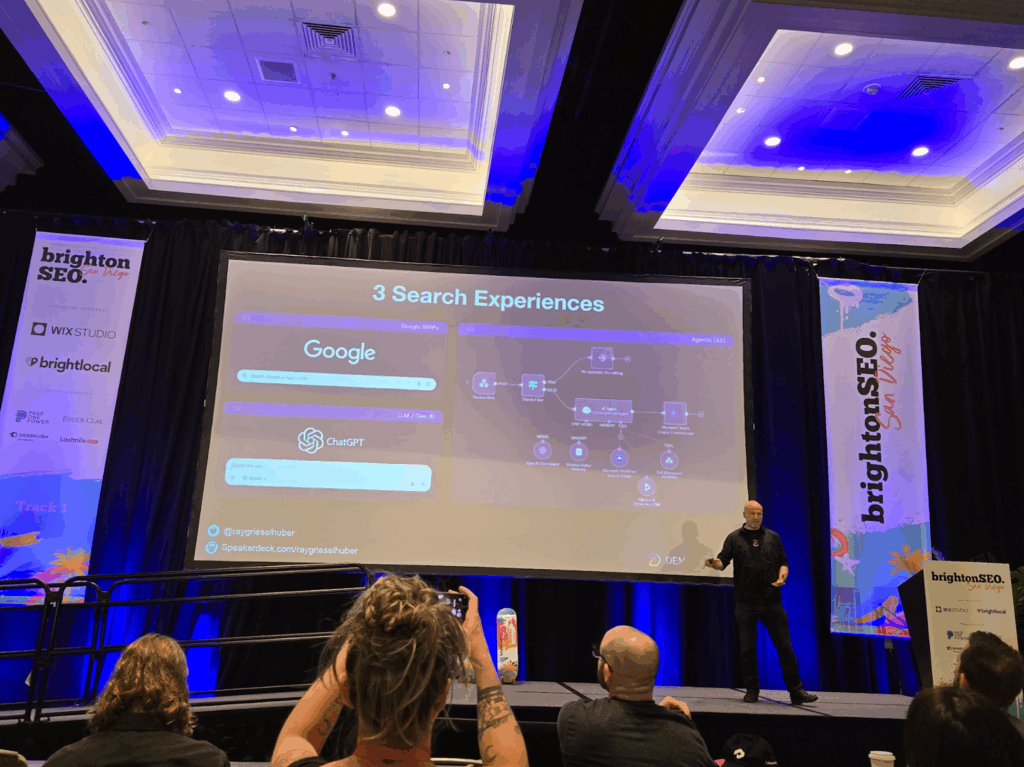
BrightonSEO San Diego 2025: Our Third Year and the AI Search Reality Check
The DemandSphere team had a fantastic time at brightonSEO San Diego last week.

Google Num 100 & Pagination Update from DemandSphere
DemandSphere will focus on the SERP data that matters while giving ultimate flexibility to those who need deeper pagi...

Google tests forced pagination on SERPs
This year has certainly been an interesting one for SERP analytics providers.

GPT-5 & Gemini Support Added to DemandSphere
I’m happy to announce that we have added support for both GPT-5 (released yesterday by OpenAI) and Gemini.
GA4 LLM Traffic Analytics (ChatGPT, Gemini, and more)
We're the first platform to track Google AI Mode
We’re excited to announce that we are the first platform in our industry to track Google AI Mode.
Use unified visibility from search data to grow in the AI search era (SMX Advanced Boston slides)
I’ll be speaking later today at SMX Advanced (Boston) on the topic of using a unified view of all the available data ...
New features: AI Search Visibility monitoring covering ChatGPT, Perplexity, AI Overviews, and more
Q1 and this first half of Q2 have been the busiest quarters at DemandSphere, to date.
DemandSphere in London and Brighton
Seven of us from the DemandSphere team attended brightonSEO last week.
April 2025 brightonSEO Presentation
I will be speaking about the relationship between AI search engines and traditional organic SERPs from Google and Bing.
Observations on the January SERPpocalypse
Anybody in SEO over the last few days will tell you that Google made some changes that took out the ability of most r...
Welcoming Duncan Sze to DemandSphere
I’m very excited to announce an addition to our leadership team, Duncan Sze.
A practical example of optimizing for AI search engines
As a follow-on to yesterday’s post about AI search strategy, I wanted to provide a practical example of what this loo...
AI Search strategy in 2025
We’re, understandably, getting a lot of questions about AI search strategy in 2025.
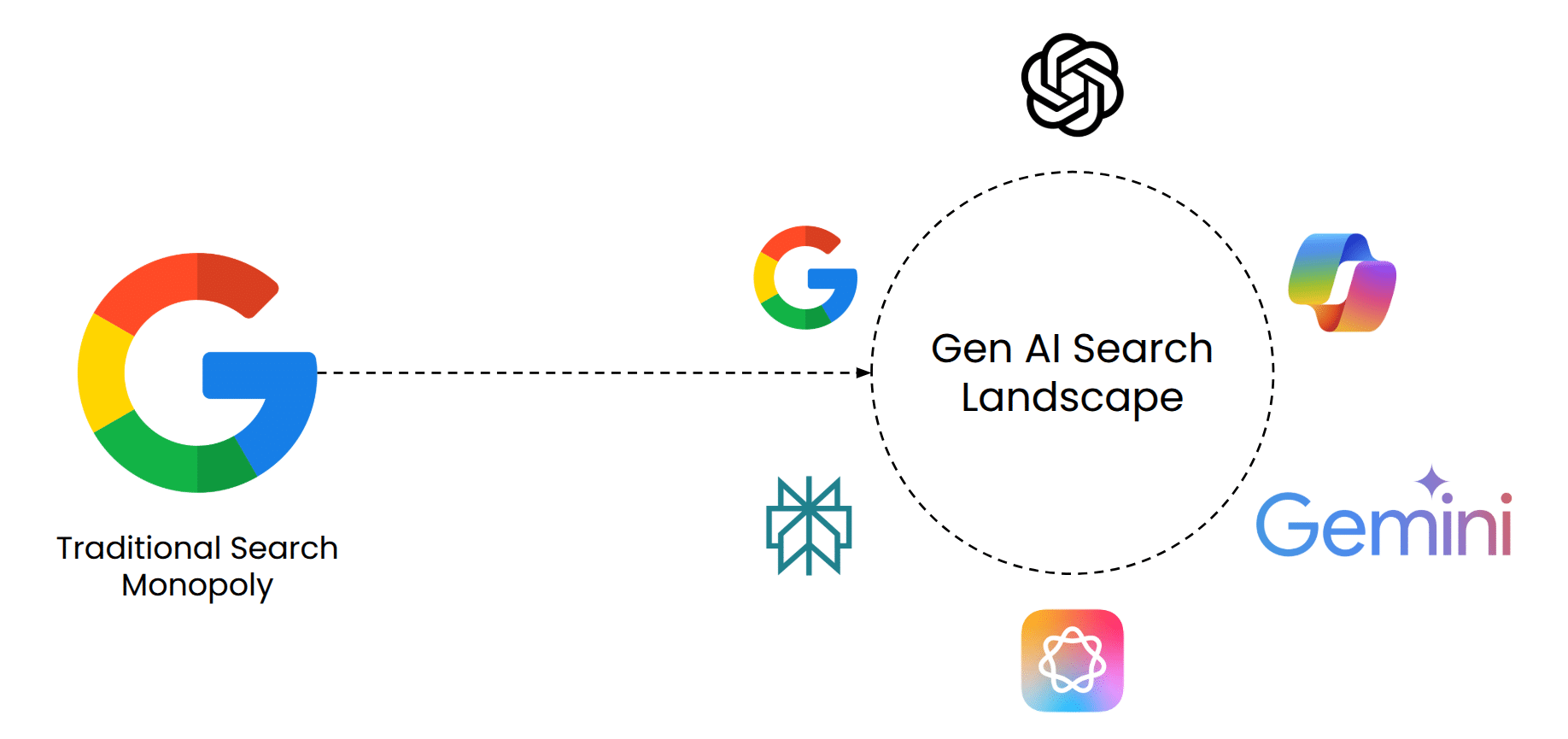
The era of AI search
2024 has been quite the year in search innovations, not only from Google, but from a whole host of players, including...

brightonSEO San Diego Slides
It’s that time of year again!
Google AI Overviews
Last week at Google I/O, Google referred that what everybody has been calling SGE as AI Overviews.

Going beyond “what happened” in SERP analytics: BrightonSEO April 2024
April has been a busy month for the DemandSphere team.

April Japan Trip
I’ve just returned home the UK, wrapping up another successful journey to brightonSEO, which will write about in my n...
Google’s March 2024 Core & Spam Update
Google just announced two new updates: a Core Update and a Spam Update.

DemandSphere Innovations in 2023
At DemandSphere, we pride ourselves on responding quickly to changes in the SEO landscape and solving the challenges ...
Summer 2023 Feature Updates
The DemandSphere engineering team has been hard at work building new features this summer, with a particular focus on...
The impact of compute on content and SEO (in both directions)
A number of articles and discussions can be viewed more generally from the angle of how the budgeting and allocation ...

Google SGE and SEO: Observations
**What is Google SGE?**

Get Google Search Console bulk export for historical data
As confirmed on both this SEO Roundtable post and this Twitter thread, Google does not support, nor do they plan to s...

Google launching Search Central Live events
Google is (re-)launching their conference aimed at search professionals, called Search Central Live. Their last event...
Learn about the new Core Web Vital: Interaction to Next Paint (INP)
Summary
Google I/O: Big changes coming for SEOs with ubiquitous AI
Google’s annual I/O event got off to an exciting start with its keynote. In summary: AI is now ubiquitous in all of i...
More Google updates for a busy April in SEO
Following fast on the heels of my post from last week, here are some additional things to follow regarding Google’s A...
Key Google Updates for SEO in April 2023
We’re only a bit past halfway through April and already Google has released a number of ranking updates and news for ...
BabyAGI: Initial Thoughts
Some initial thoughts on the BabyAGI project that is gaining a lot of traction, from the perspective of one developer.

DemandSphere February (2023) Updates - new app layout & more!
Several motivations were considered in this release.
GPT-3 and SEO: What is the future of content creation?
GPT-3 and SEO: Overview
Top DemandSphere updates in 2022
Happy New Year!
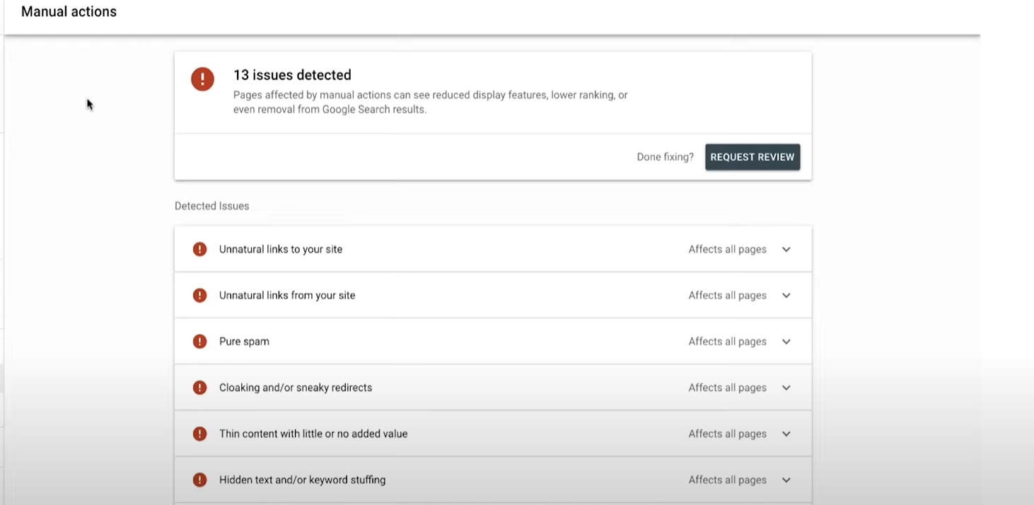
Getting back into Google's good graces after a manual action
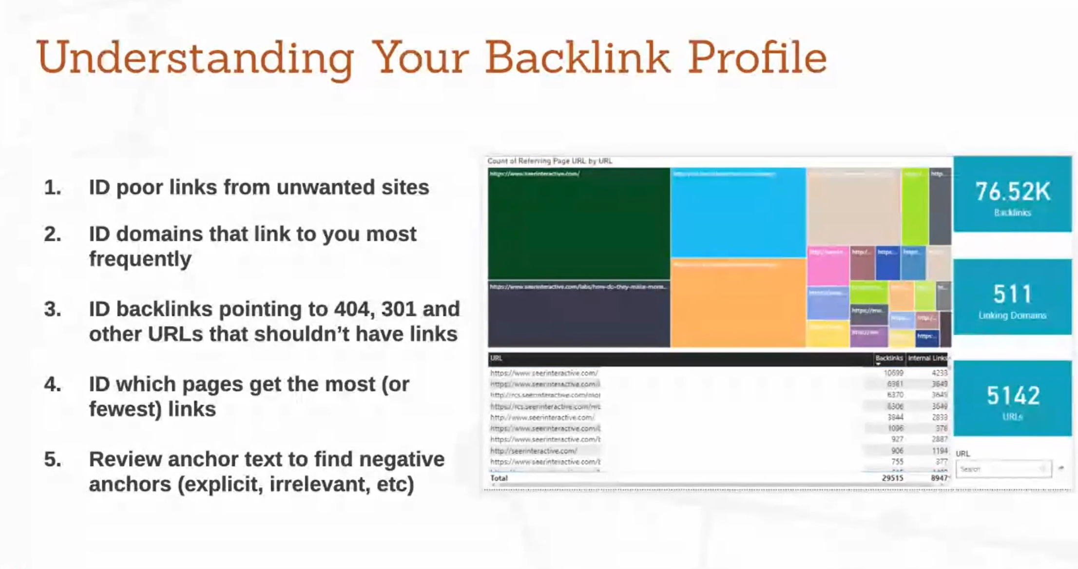
In our recent post on backlink auditing, we learned from Seer Interactive’s Zaine Clark that poor backlinks may resul...
SEO Strategy with Built-In Feedback Loops
There is a short list of difficult-to-answer and, indeed, often unanswered questions that relate to a company’s SEO a...
We've been busy
It’s been awhile since we’ve posted any updates here, but that has not been for lack of activity on our side. If anyt...
Build your own ROI site calculator -- and build a better pitch
So a marketer walks into a pitch…
What GA4 means for analysts -- and for the future of marketing
If you’ve set up a new property in Google Analytics since October, you’ve likely noticed a pretty drastic install exp...
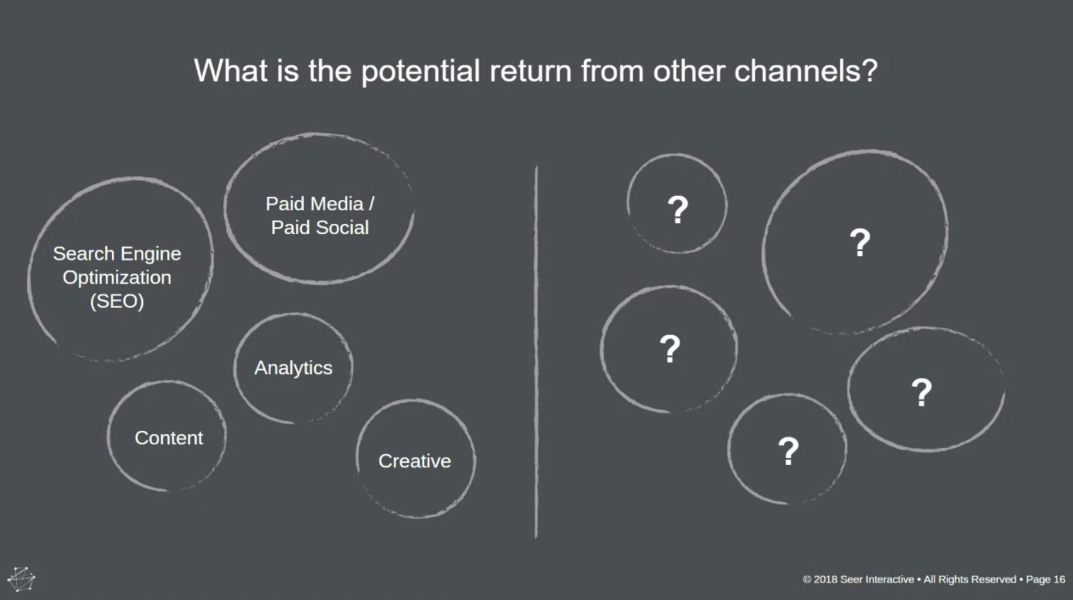
Why your competitor tracking isn’t paying off -- and how to do better.
What do we talk about when we talk about competitor tracking? For many of us, uncertainty makes competitor tracking a...
Using the language of the 'C' to get SEO buy-in
Are you desperate for a better SEO budget? Are your requests for better resources falling flat? Do you have folders o...
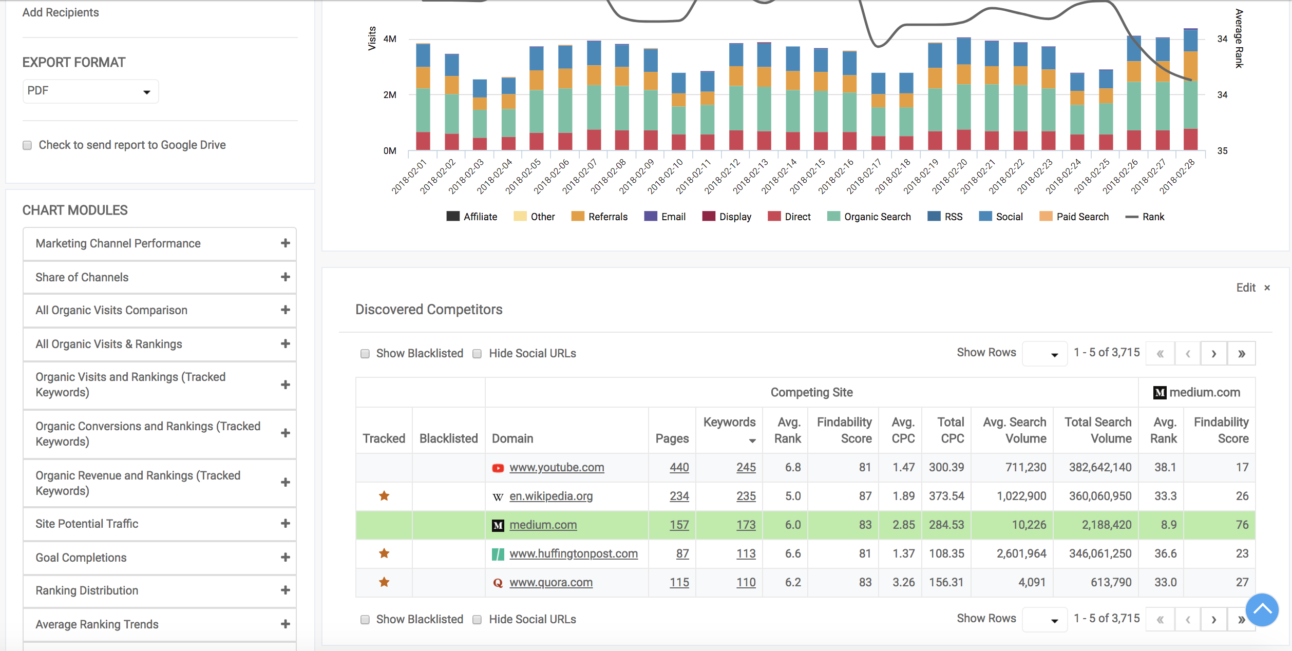
How to turn competitor data into action
Recently, we talked about identifying our real and relevant competition – and why that process is so difficult. Once ...
SEO perspectives: Should you write for user experience or for search engines?
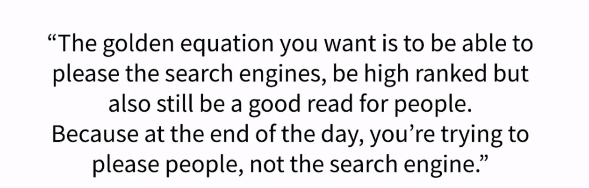
Should you be writing for algorithms or eyeballs? Which is more important – keyword-matching and structural SEO, or a...
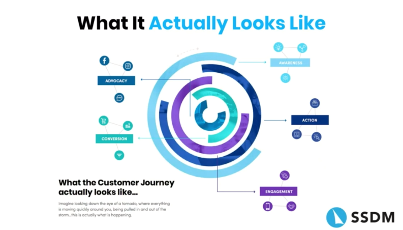
The customer journey through paid search
Paid search isn’t the “set it and forget it” solution that marketers sometimes make it out to be (try as we might to ...
Creating authentic content in red-taped industries
We say it all the time: Authenticity is key to creating an engaging audience experience. However, some organizations ...
Avoiding SEO issues in JavaScript
In many organizations, site design falls entirely to developers – that’s, frankly, what a lot of us marketers hope fo...
Technical SEO for CMS users
Technical SEO is one of the most important aspects of your digital marketing program – and the success of all of your...
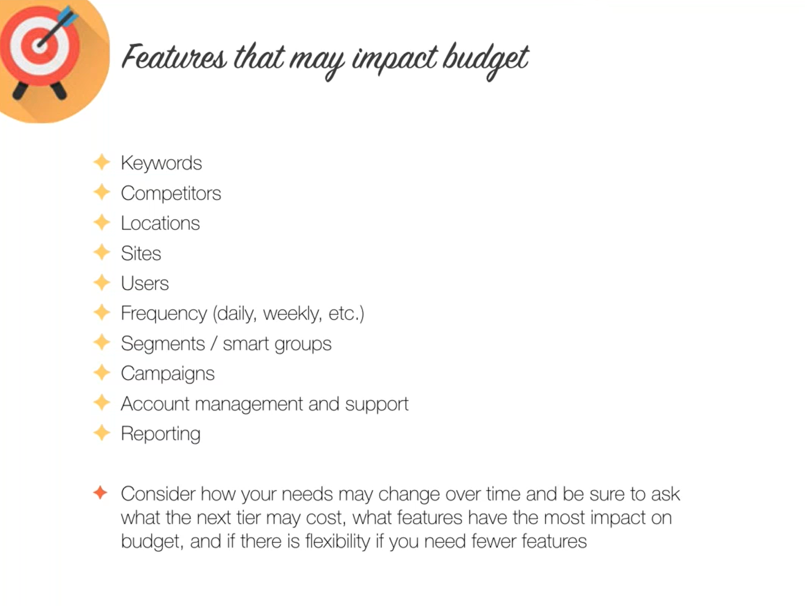
Five things (beyond budget) to look for in an SEO platform demo
A good SEO platform can make a good marketing team great, provided it meets that team’s needs. So, how do you choose ...
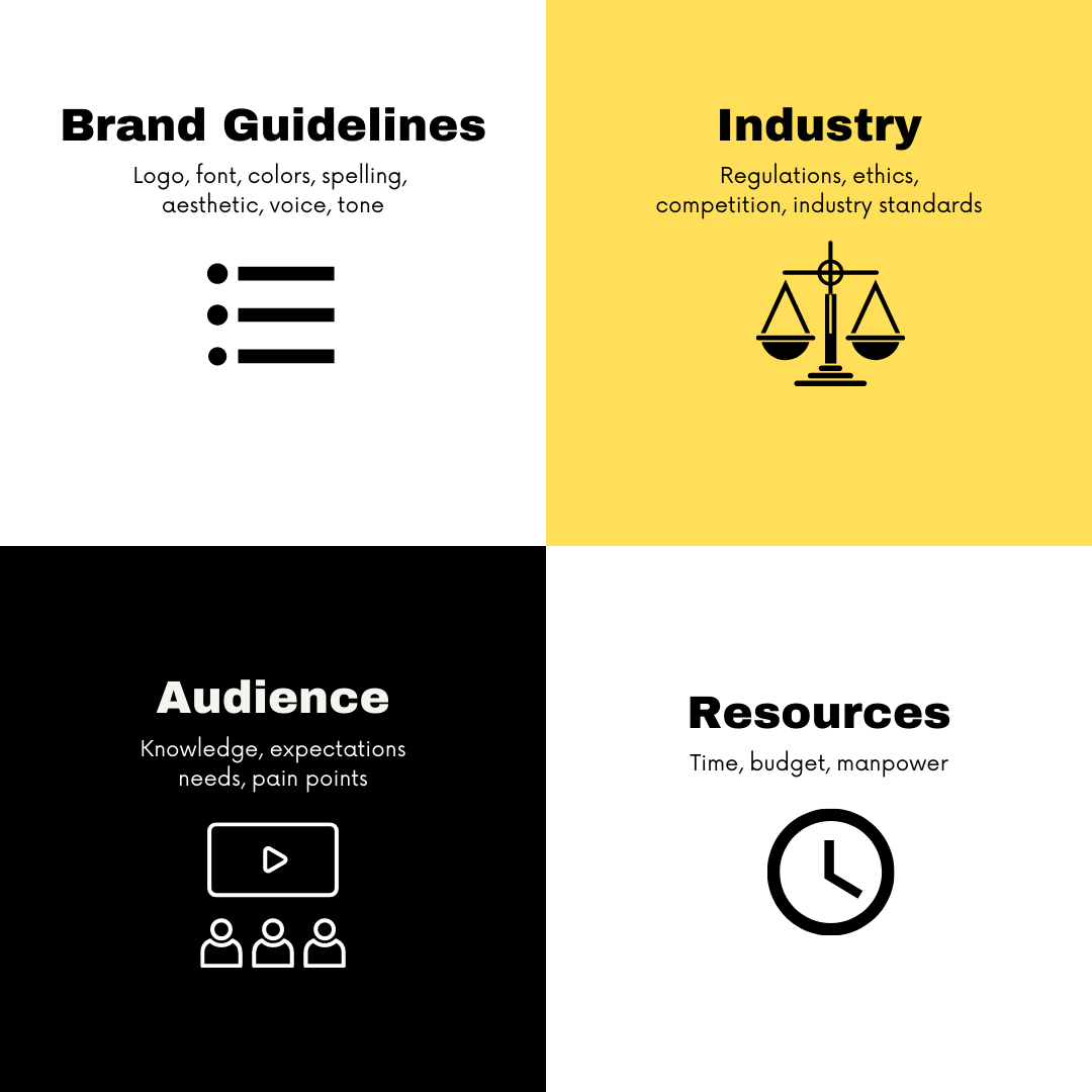
Creation constraints: how knowing your parameters makes better content
At Found Conference, Nisha Kashyap, Creative Director at Sociallyin, spoke on the content creation process. There, sh...
Survive marketing platform demo with your budget intact
Here at DemandSphere, we’ve not only created plenty of marketing platform demos, we’ve sat through several ourselves....
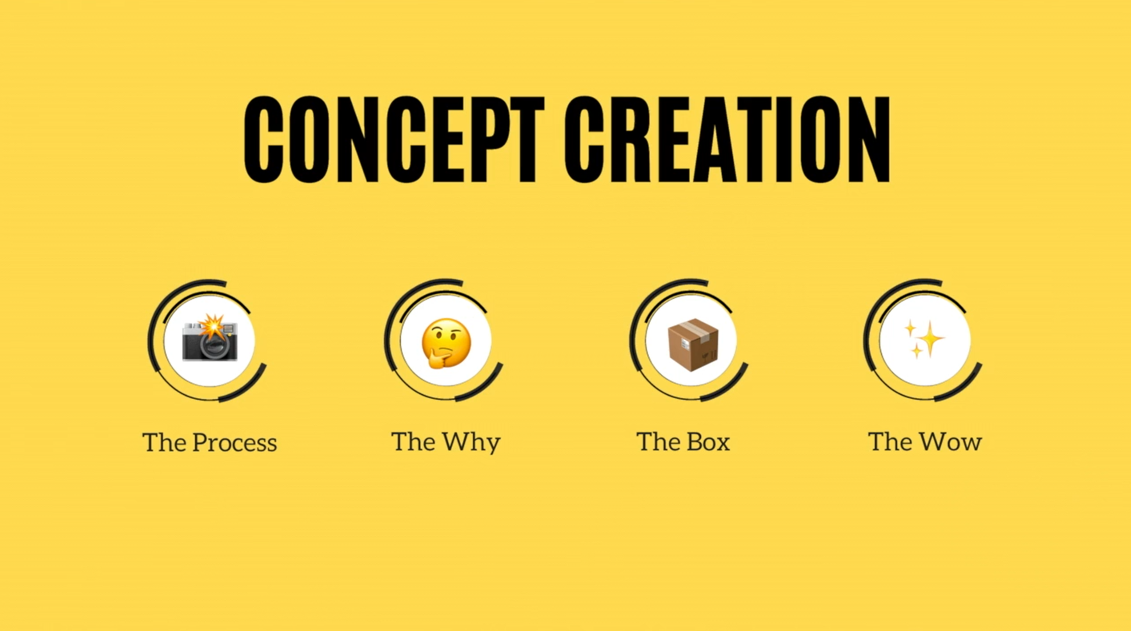
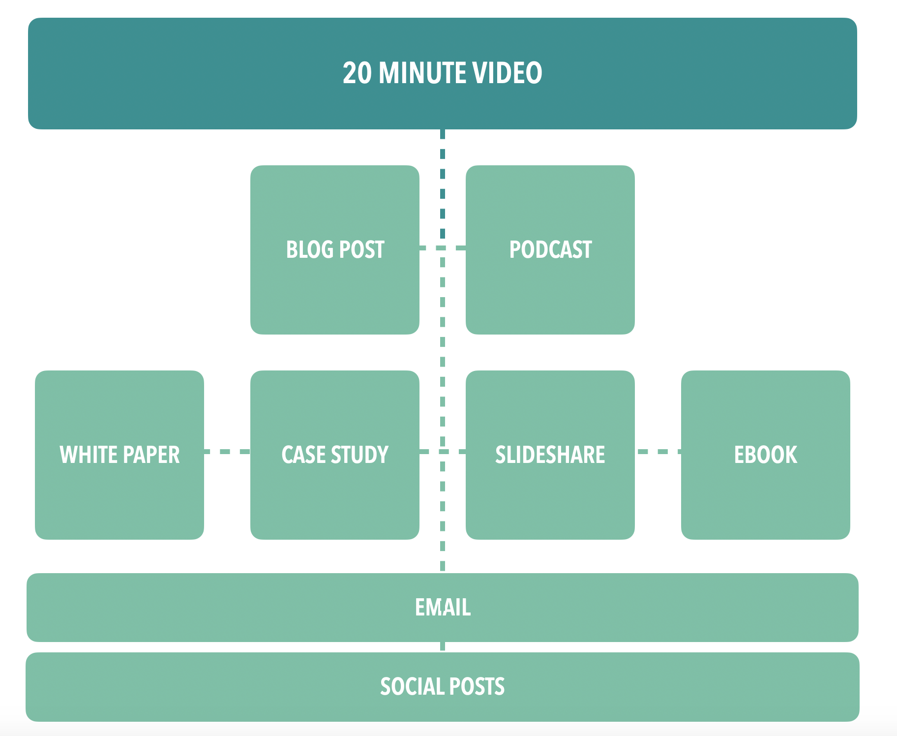
Your content creation process: Concept creation is the key
The question comes up in every interview, clients demo, or panel meetup: “What’s your content creation process?” Some...
Keeping it real: Creating unique and authentic content
Does your brand have authenticity problems? They seem to be surging. Over the past year, plenty of brands have receiv...

Let's chat: Should chatbots be part of your content marketing?
On a recent Found Friday, DemandSphere’s Erin Acheson caught up with Jasz Joseph, online marketing strategy manager a...
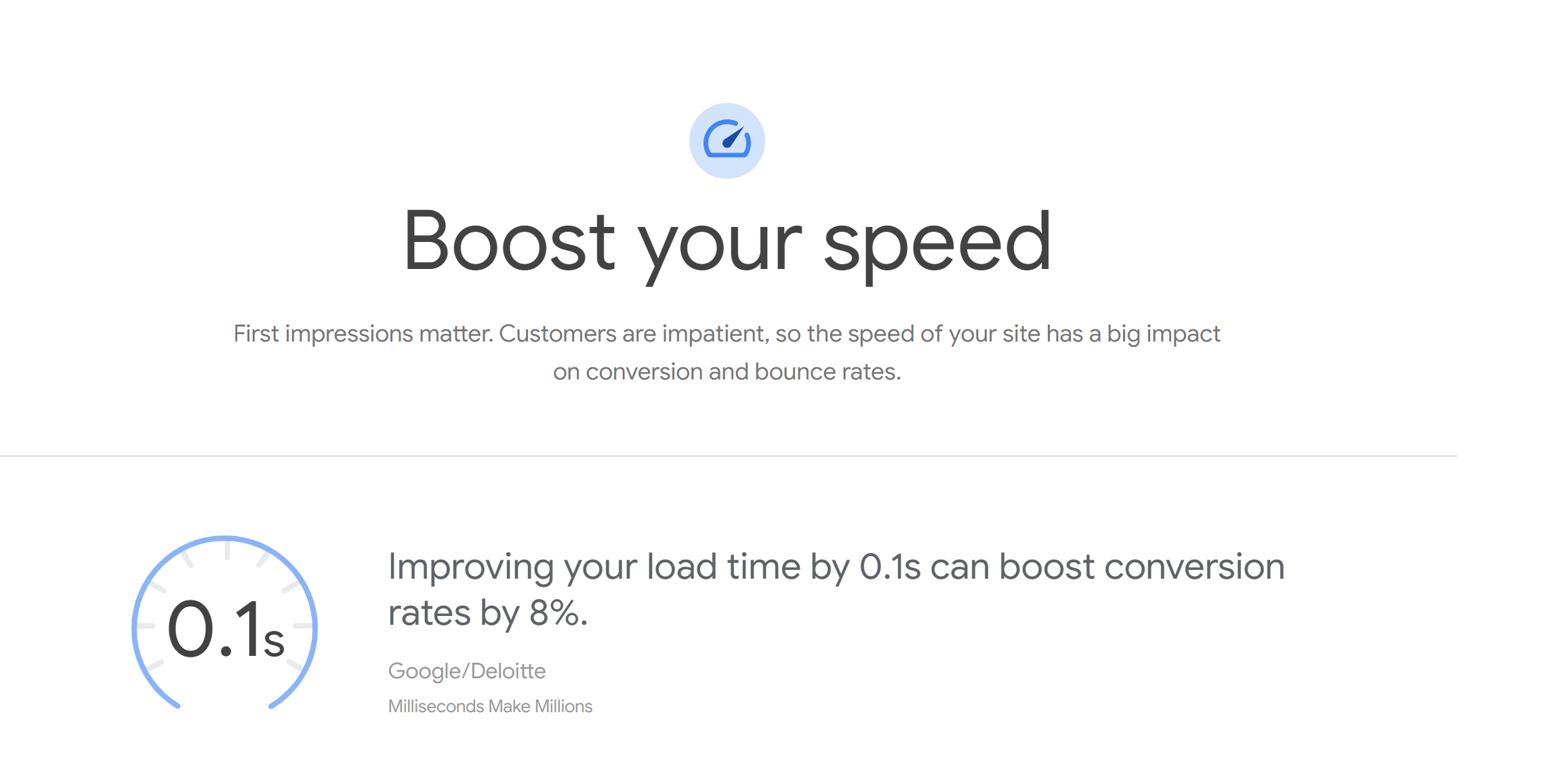
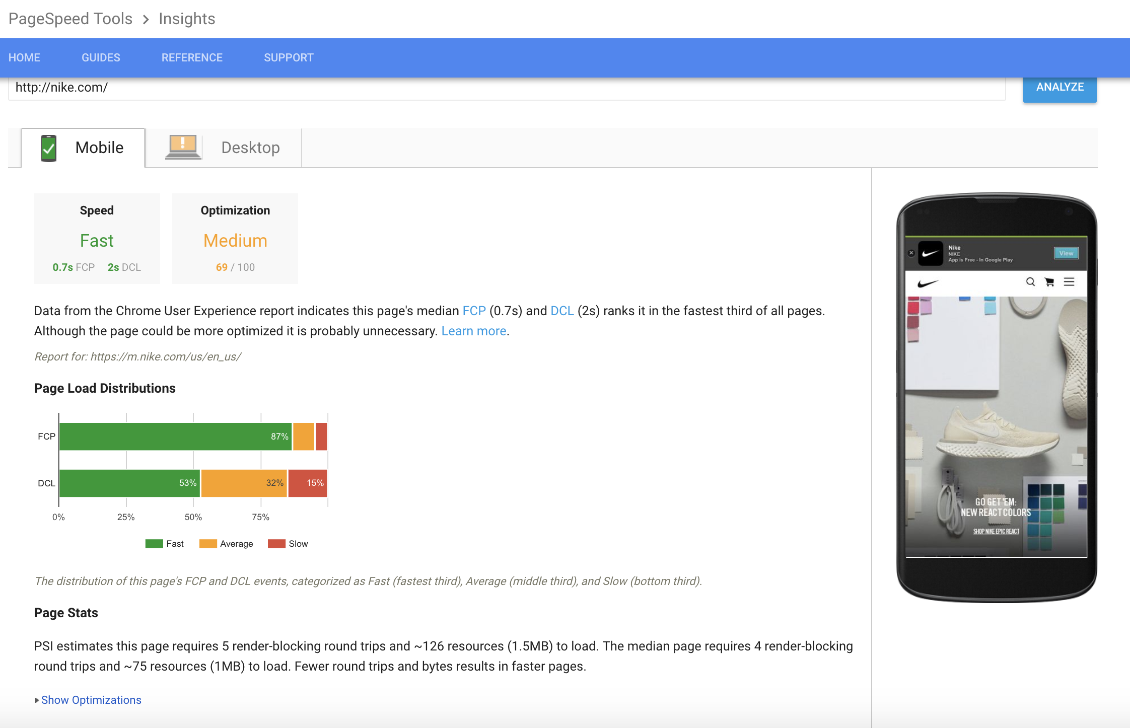
Increase page speed to improve your SEO
At this year’s Found Conference, Ray Grieselhuber, our own CEO, spoke on the importance of designing for readability....
Connecting to user values -- and pressing pause on content churn
Starting a new content channel can feel like hitting the gym on January 1: you’re excited to burn through those new g...

Where can SEO and paid media benefit from one another?
Joel Acheson, founder of Ferroic, has had a career spanning the digital landscape. Joel started his search career as ...
Backlink Auditing Pt. 2: Is Backlinking Worthwhile?
In our previous post on backlinking, we discussed the value of a backlink audit. Just as you should perform a content...
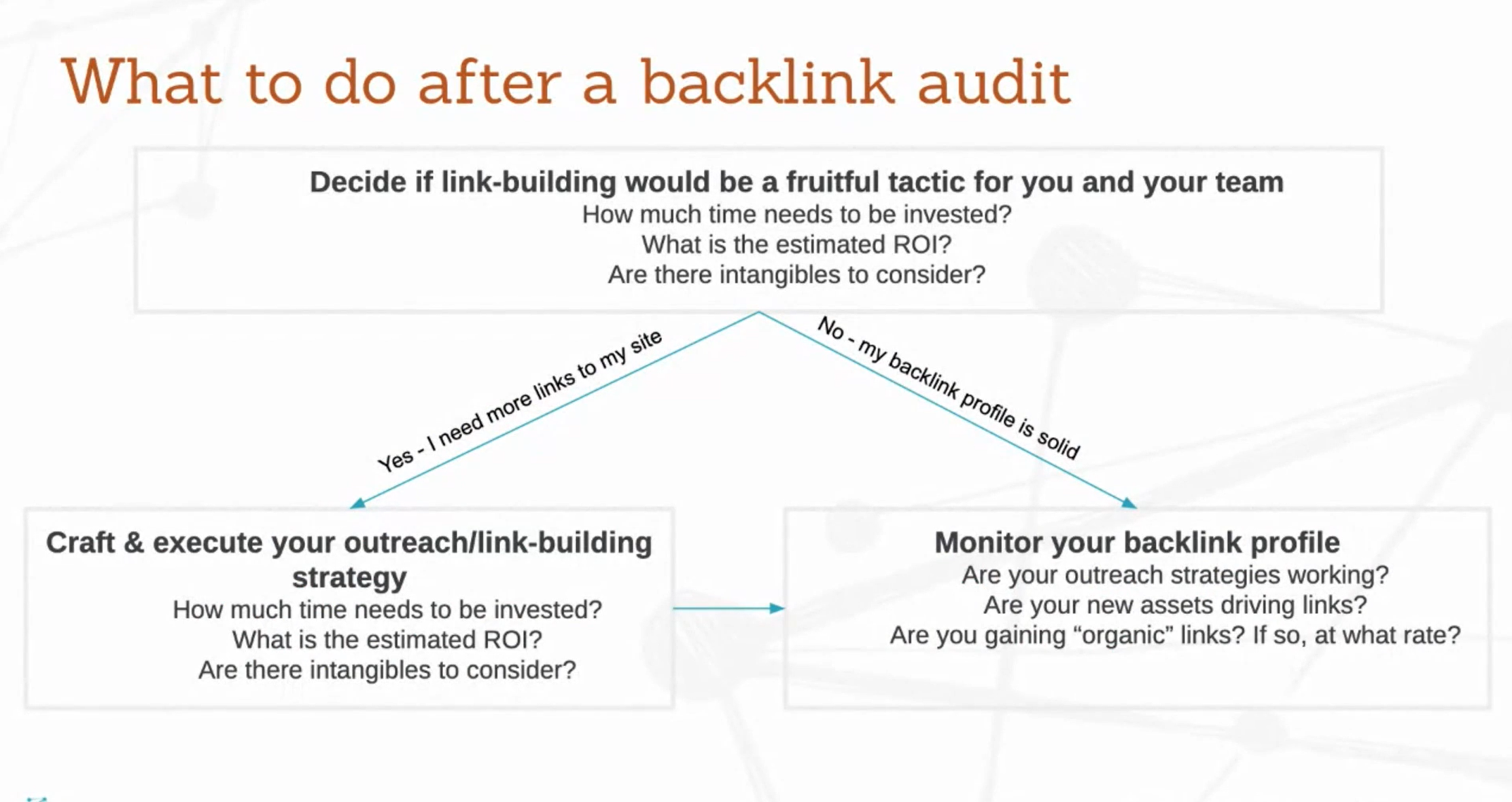
What should you do after a backlink audit? Determining a backlink strategy
Not sure whether to devote more time to inbound links and building a backlink strategy? Just follow the chart below!
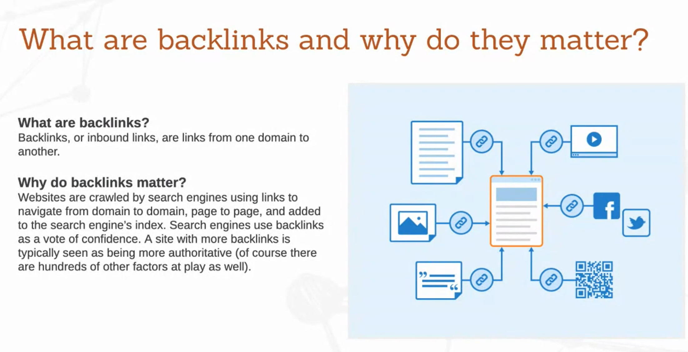
Backlink Auditing Pt. 1: How to Perform a Backlink Audit
Your backlinks are a link from any other site to your page – and they definitely impact your SEO. Backlinking is a co...

Lessons from and for nonprofits on organic user engagement
Karen Hopper, Senior Digital Strategist at M+R, is no stranger to building relationships with organic visitors. Her a...
Using behavioral intelligence to create better content
Google Analytics and other tracking tools build an awesome foundation for digital marketing analytics: we can see pag...
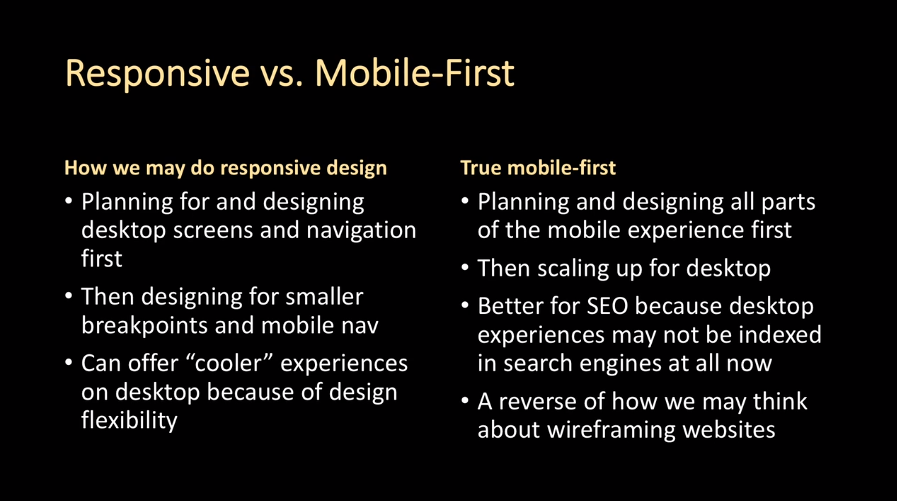
Mobile-first versus responsive design: where are we today?
In July 2019, Google announced that it would begin indexing the mobile versions of all new websites by default. That ...
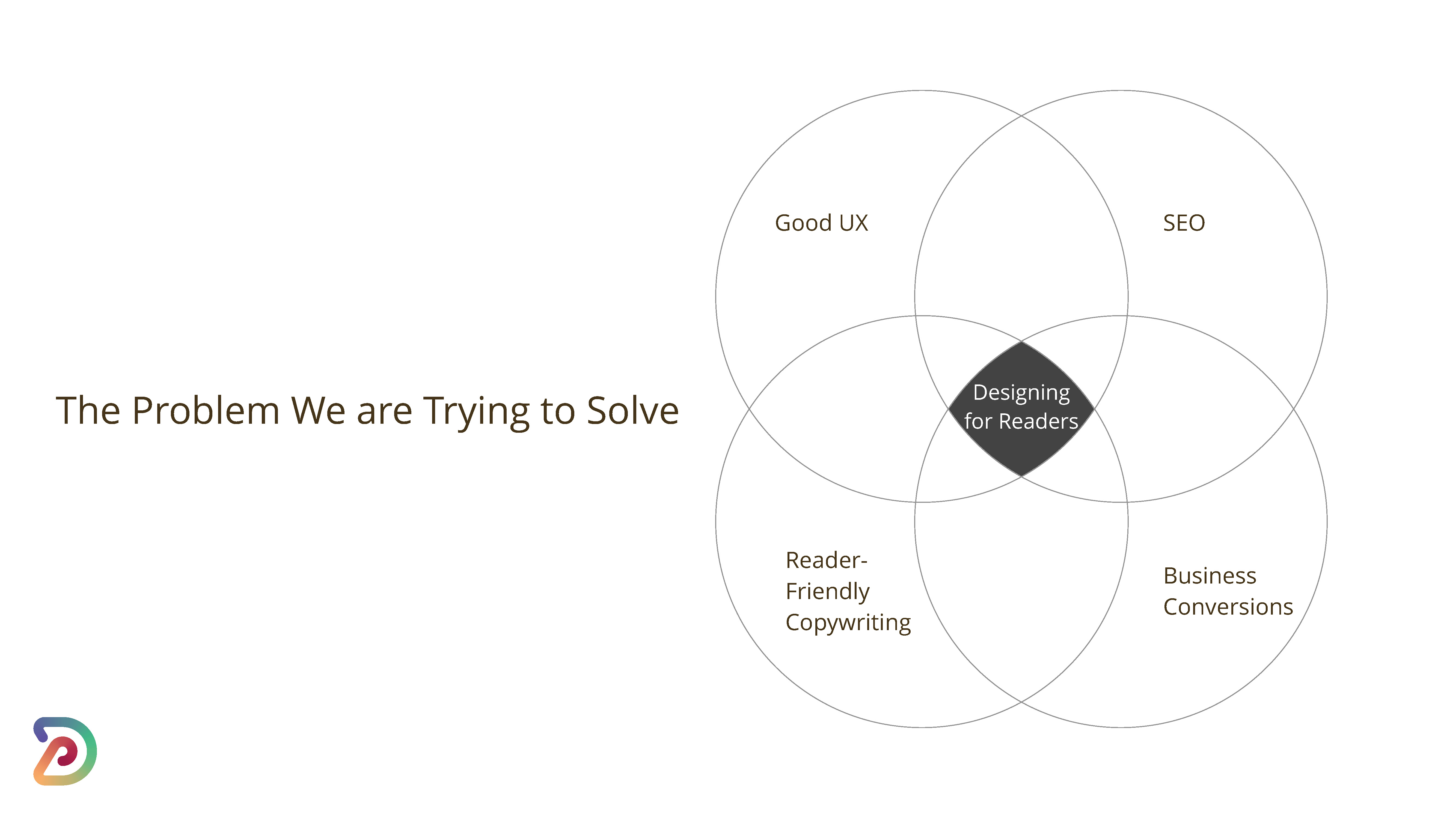
UX design with your reader in mind for high performing content
As marketers, we work under a dichotomy of bot-friendly page design and readability, constantly balancing UX design ...

Building good SEO practices and sharing your SEO 'maintenance'
Here at Demandsphere, we’re all about a whole-team approach to building good SEO. But, how do you share SEO responsib...
Five tools to help handle technical SEO
On this blog, we often talk about the need for SEOs to wear a lot of hats. Following up on every technical issue your...
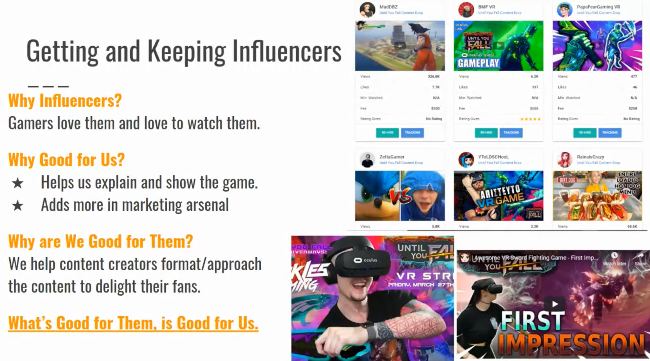
How to curate marketing influencers - and become one in your own industry
In order to build rapport with an audience and create an authentic voice, marketers need to speak their audience’s la...
Marketing funnel strategy - Better content through personalization
If you follow this blog, you know we’re all about leveraging data to improve marketing strategy. As digital marketers...
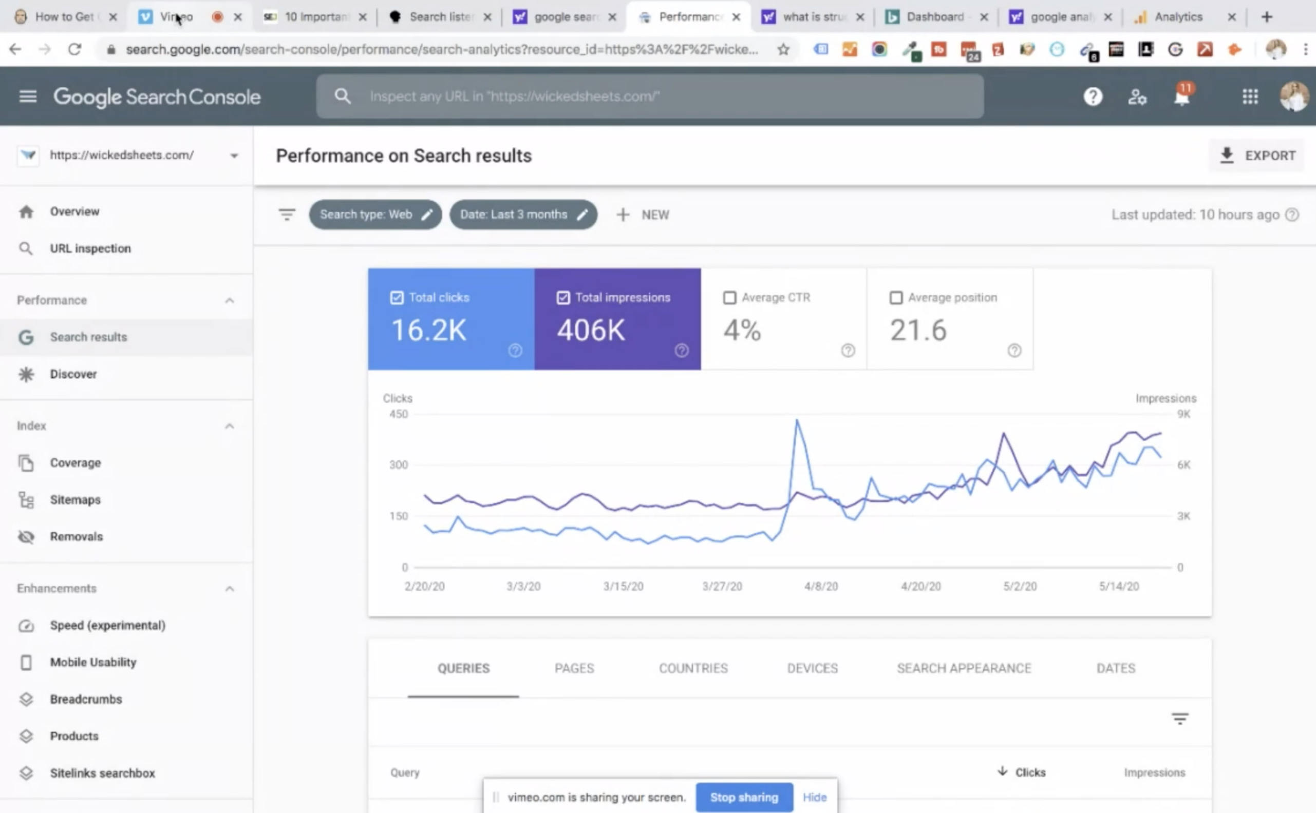
Using Google Search Console and better content choices for SEO Success
If you’re a veteran SEO, Google’s Search Console (Webmaster Tools if you’re in the wayback machine) is probably one o...
Successful live video content marketing and SEO strategy
Video is a powerful tool because it gives you something to see, hear, and experience. The combination of visual and a...
Identifying which content matters when it all matters
During Found Conference, a panel of content marketing experts talked about one of the biggest issues in content marke...
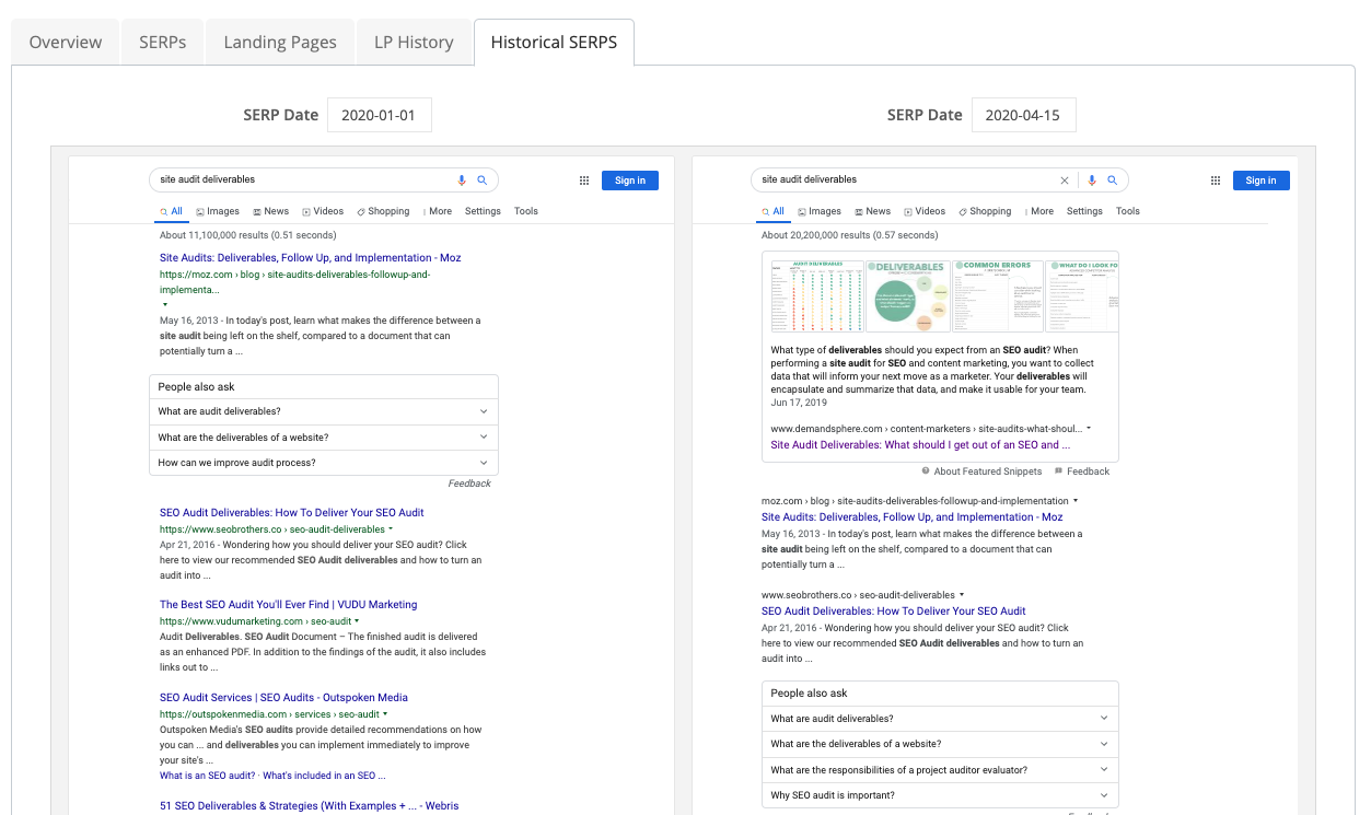
How do Google's SERP changes impact your traffic and revenue? SERP Rewind shows you.
You need a way to explain how position one or two may not be delivering the same amount of traffic or impact to your ...
Free Google Shopping Listings: Who Wins and Who Loses?
The percentage of page real estate occupied by free listings in Google Shopping has gone from 0 to 48% in a little ov...
Creating a user-focused content strategy
Think about the last search you ran – not for your business, but as a consumer. What was the impetus to start that se...
Content writing for SEO that resonates with your target audience
Whether you’re a seasoned SEO or a new copywriter, you likely have a set of writing habits that you may not even real...
Writing for SEO to create successful content
Enter “is SEO” into Google in 2020, and one of the most-searched phrase suggestions happens to be “is SEO dead?” And ...
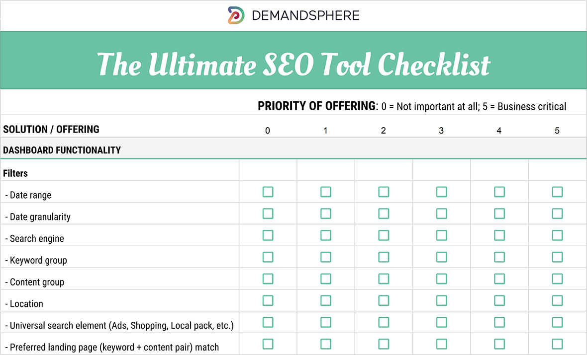
Choosing the Best SEO Platform or Solution Provider - The Ultimate Cheatsheet
Choosing the best SEO platform, service provider, or both for your business can be a time consuming task. Picking pro...
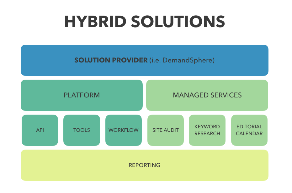
Navigating the search for the perfect SEO platform
Searching for an SEO tool? We get lots of questions about people sorting through search and content marketing tools –...

Digital Marketing Trends for Mobile SEO
This post is from a recent episode of Found Friday, where we’re talking about digital marketing best practices focuse...
Where does the SEO team fit in your organization?
Agencies and organizations take a variety of different approaches to “placing” an SEO team. Some smaller companies si...
Get buy-in from the top for your SEO and content marketing
What should you know about get buy?

SEO Simplified - Findability Basics for Marketers
In smaller organizations (and, okay, sometimes in large ones), marketers are asked to wear lots of hats – and SEO may...
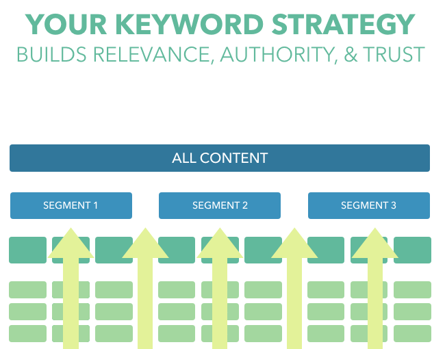
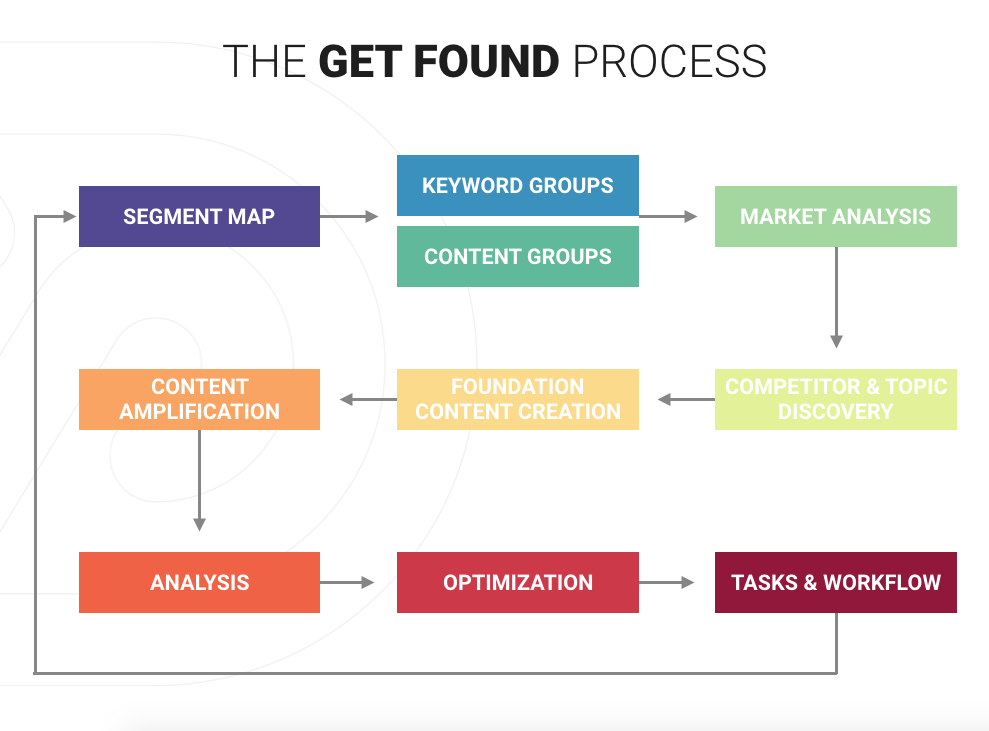
Building the best keyword strategy for marketing and SEO
This post on building the best keyword strategy is part of our Keyword Strategy for Marketers series, this post follo...
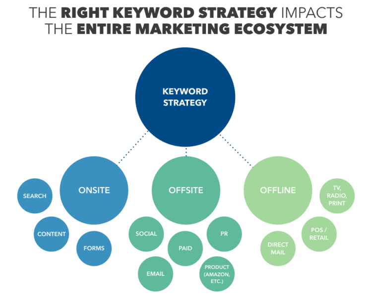
What is a good keyword strategy and how does it impact marketing efforts?
To say that keyword strategy is critical to the success of marketing and advertising is no overstatement. Keyword str...
Found Conference: A Crossroad for Digital Marketing
Found Conference: A Crossroad for Digital Marketing
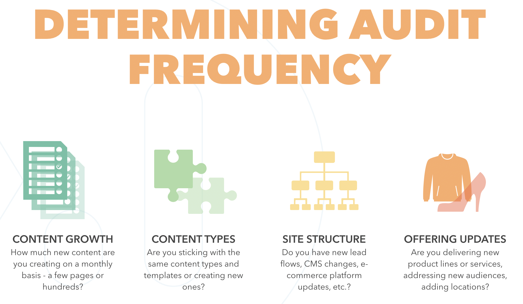
Site Audit Strategy - Who should do them and when
Welcome to the third week of our series on strategic SEO auditing! This week, the conversation turns from concept to ...
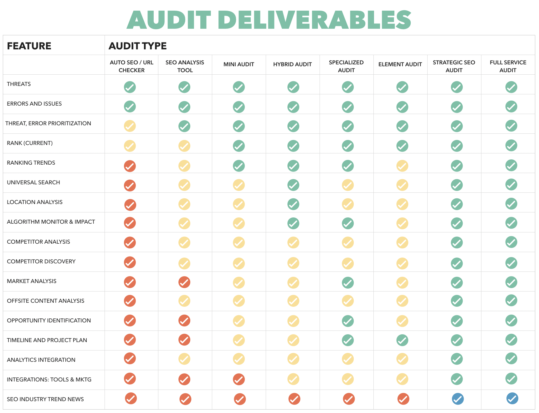
SEO site audits: What should I expect from my deliverables?
If you checked out last week’s episode, you’ll know that we’re on the second installment of a four-part series on sea...

SEO Site Audit Strategy 101: A Marketers Guide to Content Audits
Diving into SEO on an existing site can be challenging, but getting a good lay of the land is essential to correcting...

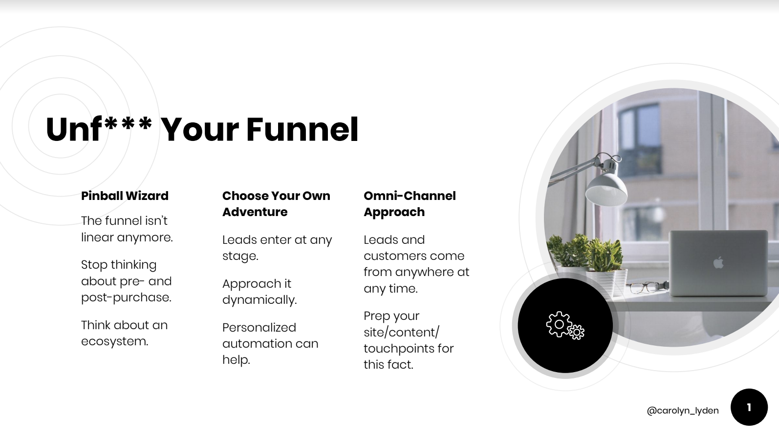
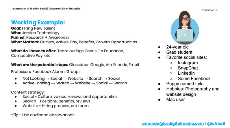
The Intersection of Search and Social Media
On a recent episode of Found Friday, I sat down with CallRail’s SEO Manager, Carolyn Lyden. Carolyn helps develop Cal...

5 ways content can improve your B2B sales cycle
What should you know about 5 ways content can improve your b2b sales cycle?
Technical SEO Optimization Tips and Updates
Following the end of 2018, let’s take a moment to look back and reflect. We have seen numerous changes in the SEO wor...

Choosing the right keywords for your SEO and marketing strategy
What should you know about choosing the right keywords for your seo and marketing strategy?

Alternative search engines and how they impact your marketing
For many years now, Google has dominated the world of search marketing. However, over the past several years, we are ...
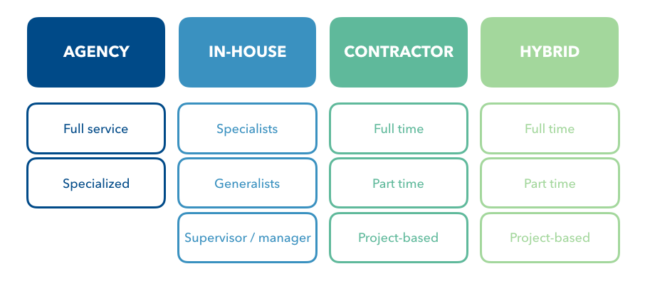
Building the right team for your SEO and content marketing needs: Agency, in-house, contractor, or hybrid
Should you hire a marketing agency or in-house employees? Do you need a team of contractors to bring your digital str...
Bridging the Gap Between Content Creation and Marketing Strategy
One of the first things we learn as children is how to share. Letting our friends and classmates use our toys and cra...
Are you tracking enough competitors for your marketing strategy?
A common topic during platform demos, conferences, and discussions with digital marketers is whether or not they’re c...
Competitor Intelligence For Content Creators, SEOs, and Marketers
Competitor Intelligence For Content Creators, SEOs, and Marketers
Tracking enough keywords? How much is enough?
A question we regularly come across in the search marketing space is “are we tracking enough keywords?” We hear this ...
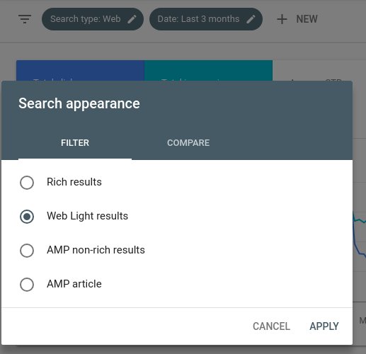
Web Light Appearance Update For Google Search Console
Google is ubiquitous when it comes to an online presence. Users turn to Google search to find information on a wide v...
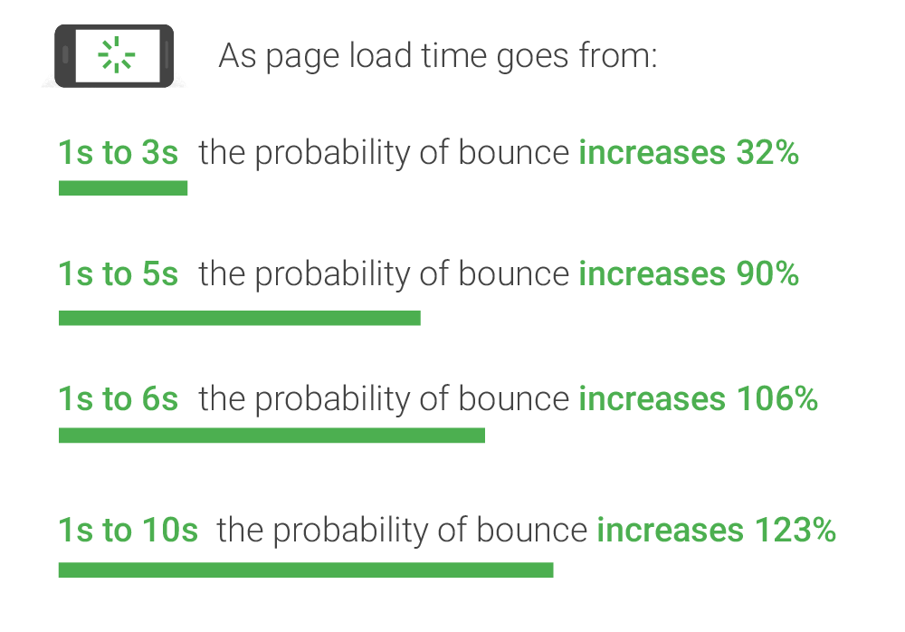
Google Speed Update: How to prepare for the upcoming change
SEOs and marketers know that regular changes to Google’s algorithm are part of their life. Many are minor and roll ou...

Are Instagram influencers a good fit for your business?
We’ve probably all seen it… The attention grabbing video and slide shows in our Instagram feed that introduce us to n...

Seven SEO writing tips for creating better content in 2018
What should you know about seven seo writing tips for creating better content in 2018?
Creating KPI driven reports to meet your goals
The best KPI reporting starts with understanding the goal system
Choosing an SEO tool that's right for your goals
Overwhelmed with SEO and content tools?
Google Featured Snippets Update - How it Impacts Your Marketing and SEO
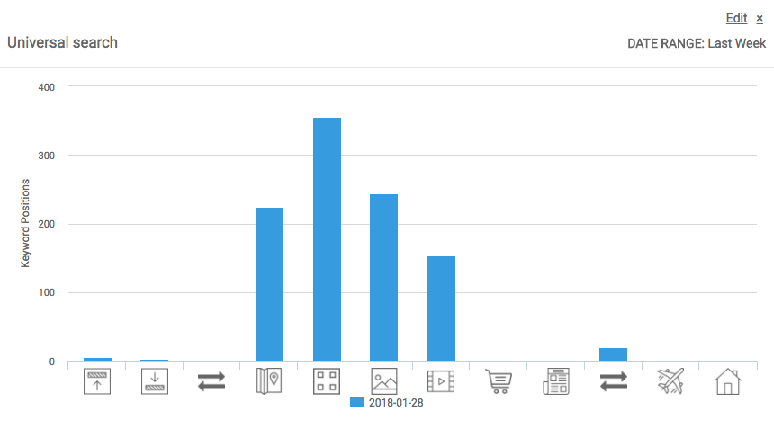
Another Universal Search update? Featured snippets get a facelift
What Google's Mobile-First Index Means for You
Google flips its approach to search indexing

How To Simplify Your Content Writing Process
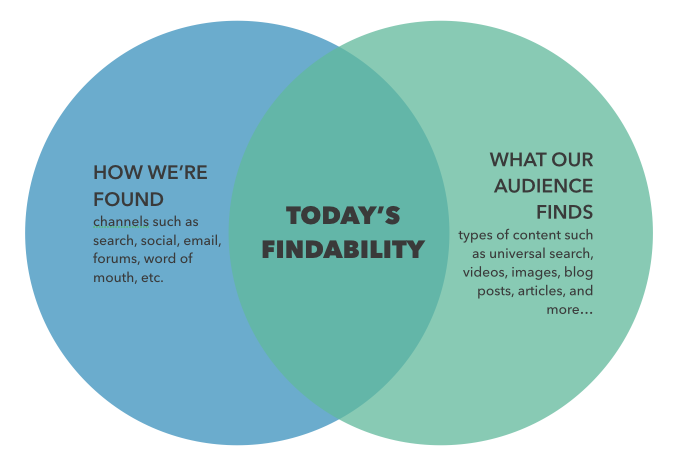
At the core of everything we do as digital marketing professionals is findability. Whether it’s a product, feature, s...
SEO Reporting Solution that Meet Marketers Needs
We frequently hear about the trouble marketers have finding an SEO reporting solution that matches all of their needs...
Amazon SEO Guide
What should you know about amazon seo guide?
Enterprise Amazon Search Intelligence - Amazon Keyword Tool and Competitor Intelligence
DemandSphere is delivering Amazon Search Intelligence to our users, with the ability to optimize millions of product...
GinzaMetrics Gets an Upgrade and a New Name - Introducing DemandSphere
If you’re familiar with our GinzaMetrics brand, you know our focus is on pioneering the science of findability. Start...
Keyword Management: A Comprehensive Suite of Tools
In search and content marketing, having a full featured set of keyword intelligence and management tools is essential...
DemandSphere - All-In-One Keyword Tracking, Discovery, and Competitor Tool
As marketers, our number one job is to enable our brand, product, content, etc. to be found by our target audience. F...
Google Search Console 2018 Update - New Features And What It Means For You
What should you know about google search console 2018 update?

Google's 2017 Algorithm Changes that May Impact Your Findability
Google has repeatedly stated it makes regular updates to its search algorithms–as many as 2-3 per day. Most of these ...
Search comes full circle
The core of all marketing efforts is findability.
Core components of the DemandSphere content marketing and SEO platform
Today, there are three core product components to DemandSphere: DemandMetrics, DemandCrawl, and ContentSphere. There ...
Why we're building DemandSphere, and why we're doing it now
The question of why DemandSphere is because we continue to see a need for an approach that takes the ecosystem into a...

Content marketing strategies that will move the needle this year
Erin Robbins, GinzaMetrics’ President & COO, joined Search Talk Live for the last episode of the year to discuss ...

Using Effective Content Marketing for Onboarding and Support: Steps to Success
In the latest episode of GET FOUND!, host and GinzaMetrics COO Erin Robbins speaks with Steveology Group CMO Steve Fa...

Hacks for finding and using internal data to improve marketing, sales, and customer success
This week on Get Found, Steve Farnsworth, CMO at The Steveology Group, joined me to discuss how to find and utilize y...

Trends in Search That are Changing the Content Marketing Game
As brands spend more and more on content marketing efforts and the internet becomes crowded with content, the challen...

Content Marketing's New Role in Lead Gen, Demand Gen, and Retention
Why are we still differentiating lead generation and demand generation programs? Isn’t the goal of any marketing effo...

Use Content Grouping to Track Content Performance
How effective are your content marketing efforts? How do you measure content performance? How do you really understan...

Create Better Personas to Deliver Relevant, Targeted, Impactful Content
The proliferation of content and the availability of more granular data have created an atmosphere where marketers mu...

Learn to Speak All Departmental Languages to Promote SEO Benefits
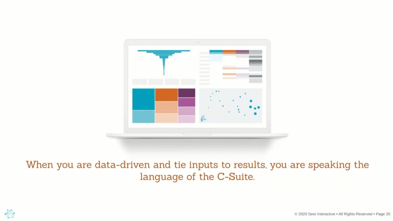
Getting the attention of the C-Suite is one step closer to making SEO a priority and promoting the benefits of search...

Get Your Next Great Content Ideas From Competitor Data
Where will you get your next content ideas? There’s a lot of advice out there about where to look. If you’re already...

Ecommerce Analytics and Trends For the Holidays
The holiday shopping season is underway and most e-commerce brands are hoping they’re ready for this busy time of yea...
GinzaMetrics Bridges The Gap Between Search and Social Analytics
As search and social data continue to inform SEO and content marketing decisions, being able to understand how the tw...

The Marketing Challenge To Adapt or Become Obsolete
In a message on the first page of the Pubcon brochure, Brett Tabke says, “Welcome to Pubcon. Adapt or die. Eat or be ...

The Growing Importance of Local For Search and Marketing
The growing popularity of mobile devices is changing the way Google is showing results for search queries. Local SEO ...

The Technology Challenge for Marketers Past, Present, and Future
When asked to think of the evolution of marketing, many start out envisioning a ”Mad Men” scene with marketers brain...
New Local Search and Deeper Crawl Features Give Marketers and SEOs Better Data
Up until now, local search ranking data has only been available as a stand-alone tool, or as an expensive upgrade to ...

Improve Social Media Posts and Engagement With Search Keywords
If you’re only using keyword and topic ranking for your search and web marketing efforts, then you’re missing out on ...
The New Wave of Global Marketing Content Marketing in China
The economy in China has shown steady growth since 2010 with a GDP average of 1.94% from 2010 to 2014. Boasting the s...
Apply Marketing Intelligence to Prevent Churn
Attracting prospects to your brand is only half the battle. Long-term growth means retaining existing customers and b...

Not Just Retweets and Likes. Measuring the Value of Social Media
Retweets, shares, and likes, all these interactions with your social media channels are easily tracked and recorded. ...
How to Get Executive Buy-In for Strategic Content Marketing Success
The most successful content marketers are the ones that have executive buy-in for their efforts while those without c...

Content Marketing The Shift from Campaign to Audience Building
When talking about the shift that marketing is taking from a short term, campaign-centric approach, to a long-term au...

Subscription Strategy The Holy Grail of Content Marketing
We recently had Joe Pulizzi, Founder Content Marketing Institute, as our guest on our FOUND series. During that discu...

Enter the Chief Marketing Technologist
The explosion of websites, user publishing, and content marketing have created an environment where data has become t...

Landing Pages to Meet Inbound Marketing Goals
You’re only as good as the material you have to work with. When you look at your inbound marketing efforts under this...

Take the First Steps to Content Marketing Strategy
The majority of content marketers do not have a documented strategy, according to the latest trends report by CMI; an...

The Strategic Marketer Master of an Effective Workflow
Marketing professionals are all saying the same thing. They want to create effective content. Although they are creat...

What's New Content Marketing? Documented Strategies
Measuring success in any field means showing results for your efforts. What is disturbing in the world of content mar...

Why It's Important to Merge Paid and Owned Media Efforts
2014 was the year of content marketing and everyone jumped on the bandwagon which led to advice from every angle abou...
Penguin 3 and Other Algorithm Updates Keep Content Marketers on Alert
The newest Google algorithm update, Penguin 3, has been a topic of conversation in marketing and SEO departments the ...
FOUND Friday Penguin 3 Friend or Foe? How Updates Impact Your Brand
Pending Google updates have marketers and SEO departments scrambling to make sure they are ready. No one wants to see...

Allocating Resources for Content Marketing
Creative content has always been a part of what companies have done to promote themselves. Until just recently, that ...

Multichannel Search and Content Marketing
Paid advertising meet content marketing. No longer can these two functions operate separately within an organization...

Get Ahead in Q4 with a Strong Content and Search Strategy
Companies fall within one of two classes: those that are prepared for year-end in September with marketing and conte...

Finding The Best Search Tools For Your Business
SEO has been around for awhile now (and despite some premature reports is not dead), social analytics is growing in i...
A New Breed of Tools Effectively Measure Content
Content marketing has become the last legitimate way for brands to reach their target audiences. A recent report by C...
Creating Measurable Content to Meet Strategic Goals
Everyone is talking about the importance of not just creating content, but creating quality content that drives sales...
Effective Workflow and Task Management for Clients and Agencies
Recently, GinzaMetrics COO, Erin O’Brien, had a chance to catch up with Fuel Interactive COO, Stuart Butler, about th...
The Importance of Making Better Marketing Tools is to Have Input on Product Development
As a marketer, our energies are often spread over a variety of tasks. We are constantly concerned with tracking our p...
Creating Viral Content for the B2B World
Creating viral content is talked about so frequently I want to scream. People spend hundreds of thousands of dollars ...
Content scoring is stupid. And potentially dangerous.
As you can tell by the post title, I have an opinion about content scoring for marketers. Content scoring’s heart is ...
GinzaMetrics teams up with Airbnb to discuss global search marketing strategy
A common topic of discussion at GinzaMetrics and within the search community we’re a part of is global search and mar...
Channel Performance Chart is Now Live in the GinzaMetrics Dashboard
Upon logging in to our dashboard today, GinzaMetrics users will notice a new chart on the main screen. The Channel Pe...
What Brands and Agencies Should Consider When Evaluating Search Tools
Brands and agencies have a myriad of choices when it comes to search tools, requiring time and effort to determine th...
Klout Increase Your Score By Creating and Sharing Great Content
On February 6, Klout announced that it was adding a new content platform. The company, established in 2009, measures...
How to Manage SEO with a Small Team
Many companies lack the resources to have a massive and dedicated SEO team. Startups, sole proprietorships and small ...
FOUND Friday What's Hot with Hotwire PR
On Friday, January 24, Hotwire PR’s Managing Director Leslie Campisi will join GinzaMetrics COO Erin Robbins O’Brien ...
GinzaMetrics Integrates with Google Webmaster Tools
Google Webmaster Tools has become an essential tool for marketers and site managers because it provides an objective ...
GinzaMetrics Brings Real Time Insights to Search and Content Marketers
One of our primary goals at GinzaMetrics has always been to provide the most recent and relevant insights to our cust...
GinzaMetrics PDF Reporting Feature Improved
Today we’re announcing some massive improvements for our PDF Reporting feature, which brings additional enhancements ...
FOUND Friday What are the Best Search Tools for Brands and Agencies?
Watch Our Hangout
The Real Future of Social is Search from Search Engine Journal
We just wanted to give you a quick heads up that GinzaMetrics COO Erin Robbins O’Brien recently had an article publis...
Freaker Uses Lifestyle Content Marketing To Build Loyalty and Grow Engagement
In a world laden with boring beverage insulators (sorry, koozies), one product stands out. Meet the company that seek...
Increasing Your Findability with Search and Social Media
Social media continues to gain popularity. According to the Pew Internet Project, 72 percent of U.S. adult internet u...
The State of Search
We now have a slideshow that outlines key takeaways for marketers surrounding Google’s recent Hummingbird and Secure ...
FOUND Friday The Intersection of Search and Social
Watch Now
Applying the Dragonfly Effect to Search and Content Marketing
Many of you may already be familiar with the book The Dragonfly Effect written by Jennifer Aaker and Andy Smith. Whil...
Holiday Search and Content Strategies for Ecommerce and Brands
In 2012, ecommerce sales surpassed a trillon dollars worldwide, and guests on our recent FOUND Friday agreed that eco...
FOUND Friday Get Mobile and Search Insights to Help Your Brand Get Found
We sleep with our smartphones by our side and tablet ownership continues to increase, so it’s not surprising that th...
Google SERP Click Through Rates Visualized
With Google Secure Search (not provided) coverage nearing 100% over the next few months, there will be a renewed inte...
What is Good Content?
We know that content marketing is a must for brands that want to be found online, but successful marketers know that ...
FOUND Friday Avoiding SEO Disasters
<iframe src="https://www.youtube.com/embed/5I3OIV_Q_5A" width="420" height="315" frameborder="0" allowfullscreen="...
FOUND Friday Where Does SEO Fit In Your Organization?
On August 16, we hosted our first FOUND Friday hangout. GinzaMetrics’ Erin Robbins O’Brien and Ray Grieselhuber chatt...
How to Attract Your Target Audience When Utilizing Social Media
There are several important lessons that companies and agencies MUST learn about the use of social media if they wish...
The Intersection of Search and Content Marketing
Recently, I was invited to join The Friday Hangout to discuss the intersection of search and content marketing. I had...
New Feature Chart Drill Downs Provide Added Keyword Insight
Today, we’re releasing a new feature enabling GinzaMetrics users to gain more insight into their daily keyword rankin...
Becoming a Modern Marketer by Embracing Art and Science
In this world of 140 characters or less, there is still a place for those of us who enjoy both storytelling and analy...
The Summer Data Sweep Checking In with Your Content at the Halfway Point
How does your company’s content get created? And how much content is there? What does your company consider “content”...
List of Things You Probably Shouldn't Write About Anymore
I’m not trying to discourage people from writing. At all. I’m also not trying to prevent good content from making its...
The Content Inspiration List
As part of a new series of lists of recommended people, places, websites and resources - I figured I would kick it of...
Better Reporting Means Happier Clients
What should you know about better reporting means happier clients?
Mad Men and AMC Setting a Social Media Standard
Fans of “Mad Men” were abuzz on social media this weekend with the much-heralded show’s season six finale. As I watch...
Google Authorship Why It’s Important for Google and Authors
At first, Google Authorship was just something that was interesting; not necessarily anything that SEOs or bloggers t...
Build an Online Community by Stepping into the Unknown
Stepping outside the proverbial box and into the unknown helped me to build an online community around running and li...
Why Flame Wars are Relevant to Content Marketing
I admit, as someone who loves popular news stories and content, I get a little jealous when I see a controversial pos...
Why Build a Healthy Blogging Community
There are various aspects of blogging that shouldn’t be ignored. Professional bloggers or businesses hoping to engage...
GinzaMetrics Enterprise SEO Platform Gets a Content Marketing Boost, Expands Leadership Team
Digital marketers are showing their intense focus on using social and content marketing to drive ROI for their busine...
4 Online Resources to Inspire Great Content
In 1996, Bill Gates coined the phrase “Content is King.” Today, it is one of the more critical aspects of growing a w...
All Eyes on Data and Content at New South Digital
I recently attended the New South Digital Marketing Conference in Myrtle Beach, South Carolina on behalf of the Ginza...

But Would Your Grandma Use Tumblr?
Perhaps the most talked about story in social media or in tech over the last week or so is Yahoo’s $1.1 billion purch...
Get Found: GinzaMetrics Announces New UI
The team at GinzaMetrics is excited to announce the launch of a new user interface and website for our enterprise SEO...
What Would Jack Dorsey Say About your Twitter Feed?
Twitter is not only a platform to connect with your current customers, it can help you acquire new customers, engage ...
The Joy of Keeping It Real. Why Small Events Have Big ROI
Last night we held our second FOUND Conference event. As a small startup (under 10 people) putting on an event, even ...
FOUND Silicon Valley Debuts at 500 Startups with Great Speaker Lineup
The GinzaMetrics team is excited to announce that FOUND will be holding its first Silicon Valley event at 500 Startup...

See Impact of Panda and Penguin on Site Traffic With Delegator's AlgoSleuth
This week our friends at Delegator, a data-driven interactive agency and customer of ours, released a valuable new to...
The 2013 State of Content Marketing Survey Results. Are Your Goals In Line?
As the GinzaMetrics Team is getting ready for our FOUND Conference on the Future Of Content Marketing and SEO (» **Ge...
4 Tips to Improve Site Retargeting Campaigns
a guest post by Derek Singleton **Buyers continue to turn to the Web to research, review and compare products before ...

GinzaMetrics Provides New Keyword Reports for Big Picture Data Views
We are happy to announce two new reporting features for our SEO and content management platform users. Both of these ...
GinzaMetrics Releases Ranking Trends and Findability Scores for Competitor Monitoring
The GinzaMetrics team is excited to deliver additional advances in our users SEO dashboards this week. You can now go...
Better Competitive Monitoring and Improved Account Dashboards
Over the weekend, we released a big improvement of two of our most popular features: competitive monitoring and accou...
Announcing Odin Authenticator Single Sign On for Apache
As we are scaling our server-side infrastructure at GinzaMetrics, a relatively minor problem initially became a major...
Check Out Our New Reports and Charts
A couple of months ago, we began to rewrite our entire reporting engine and improve on the type and manner of insight...
Ginzametrics Gets New Site Creation and Settings Wizards
Today we’re announcing some big changes in the way users can register and manage sites within Ginzametrics.
SEO and The Search Engine Market in Russia
Today’s guest blog post will be devoted to the overview of the Russian search engines and SEO techniques. I know that...
The Power of Linking Out
Building relationships on the internet, like in the real world, is not easy for all of us. You may be working in a bo...
The Definitive Guide to SEO and Inbound Marketing in Japan
I’m happy to announce our first webinar and we’re putting it on together with one of our favorite partners and earlie...
Retargeting, A Great Way to Market, or Kinda Creepy?
It’s like this—you know you shouldn’t eat that slice of pizza, but before you know it you’ve eaten it…and the one nex...
Amazon Cloud Search Service - Our Wish List
Amazon appears to be readying a new cloud search service. This could be many different things: full-scale, programmat...
Improving Our SEO Rankings Visualization
One of the most consistent pieces of feedback we’ve gotten from our users is that our original visualization of keywo...
9 Quick Tips: How to Answer Customer Support Emails
Fact: Users write customer support emails and if they don’t, you should seriously start worrying. Even if they report...
An Overview of the Ginzametrics Platform
SEO Dashboard Video

Can You Outsource Product UX and UI Design Successfully?
Over the weekend, I ran across several ads for UI / UX contractors from web and mobile startups, looking for someone ...
The Real Story Behind Google +1
There was a lot of buzz a couple of days ago when Google released +1, a simple button that supposedly lets people rec...
What Site Owners Need to Know About Google +1
Yesterday, Google announced a new feature for both its search engine and site owners (in the near future). You’ve lik...
Understanding Centralization Vs Decentralization in SEO
This blog post is about a management study already 29 years old. The post culminates in an explanation of a type of c...
A Few Quick SEO Tips
New as I am to search and SEO, I’m only just discovering the basics. I thought it might be helpful to write up some o...
Is Trader Joes Really Not on Twitter?
I had an unpleasant experience at Trader Joe’s this weekend. The manager’s response was so lethargic that I decided t...
Product Simplicity and Second Order Sales
The 37signals “less is more” school of product development has caught fire, and for good reason. It’s often better fo...
RVM and Bundler in Five Seconds
Last week I wrote about how search affects programming language design, pontificating about how easy it is to find Ru...
Y Combinator Looks for Outliers
It’s application season again at Y Combinator again, so I thought I’d share my perspective on what they are looking f...
Meet the New Ginzas
I’m happy to say that Ginzametrics is no longer a one-man band. Over the last month, two new hackers have joined me, ...
How to Deploy a Rails app to EC2 in less than an hour using Rubber
One of my first tasks as a new developer here at GinzaMetrics has been to help migrate our production servers to AWS,...
Ginzametrics is Hiring an Engineer in Tokyo
Despite the name, it is a little-known fact that Ginzametrics was actually born in Japan. I came up with the name aft...
Ginzametrics is Hiring Two Engineers
Ginzamarkets, Inc. produces Ginzametrics, a new kind of marketing platform for advertisers and agencies. I’m focused ...
Ginzametrics Adds 12 New Global Markets
Ginzametrics is a platform for managing sophisticated SEO campaigns in many global markets, simultaneously. The featu...
The Royal We Single Founder Startups
It has become a common wisdom of sorts in the startup world that if you are running your business without a co-founde...