One of the most consistent pieces of feedback we’ve gotten from our users is that our original visualization of keyword rankings made it very hard to scan for changes.
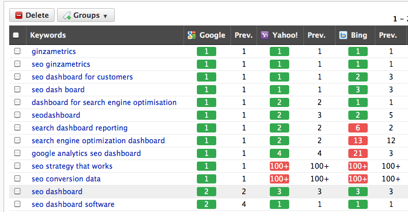
This is what our rankings dashboard looked like until earlier this week. It had a pretty simple rule for displaying changes in rankings: green for keywords that stayed the same or increased in rankings and red for those keywords that dropped in rankings.

There were several problems with this, however.
- Having green be the color for rankings that stayed the same and increased made it very difficult to scan for changes.
- We were showing the previous ranking but not the change from the previous position, which is what people really care about. Users had to do the mental math to figure out how many positions they had increased / dropped.
- We put the ranking, not the previous / change number, in the colored box, which put the information about rank movement on the wrong metric.
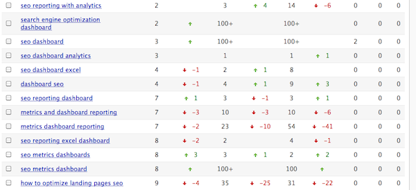
We decided to try something new with the rankings. Instead of the little green and red boxes, we used arrows (up/down), which are used in many other ranking tools. We also changed the previous column to a column that showed the delta or change in rankings. We also added row striping, used a more neutral font color and increased the row height to clean things up a little.

The result was much cleaner, it showed true directional indicators on the change column and made it easier to scan. But we spent quite a bit of time squinting at the UI and we realized that things didn’t pop the way they used to. All of the little arrows blurred together and there wasn’t enough impact on the UI to draw people’s eyes to the action. We also felt that the little boxes were kind of a Ginza signature, you could look at it and immediately know that you were using our app.
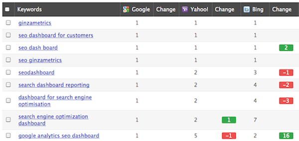
So, we tried a third version, which we released this week. It solves the original problems of scan-ability and lack of information about change in direction. It brings back the boxes but puts them on the delta column and only shows them for rankings that have changed.
The result, in our opinion, is much easier on the eyes. We want to hear what you think too, so drop us a line!

