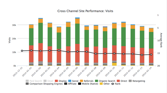
Upon logging in to our dashboard today, GinzaMetrics users will notice a new chart on the main screen. The Channel Performance Insights chart provides a collective view of website traffic from multiple marketing channels. We are excited to add this chart so that brands and agencies can gain a better understanding of the channels driving audiences to their content. Recent Adotas and Search Engine Watch articles have highlighted the challenges facing marketers when it comes to effectively utilizing data and analytics. There is no shortage of information, but many providers are only showing one segment of the marketing mix, require extended integration or are cost prohibitive. These challenges create delays in creating marketing assets that produce results, and we believe that marketers deserve actionable data now.
What should you know about channel performance chart is now live in the ginzametrics dashboard?
Access to Insights from Multiple Channels
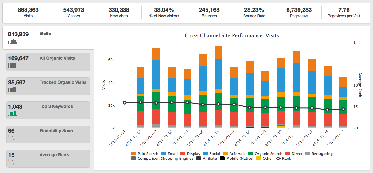
GinzaMetrics’ Channel Performance Chart delivers an interactive overview of all drivers to a user’s content, including: organic / search engine, email, paid search, comparison shopping engines, social media, affiliate sites, mobile, retargeting, display advertising and more. These channels are listed in the legend below the chart’s x-axis.
Interactive Chart Provides Deeper Data
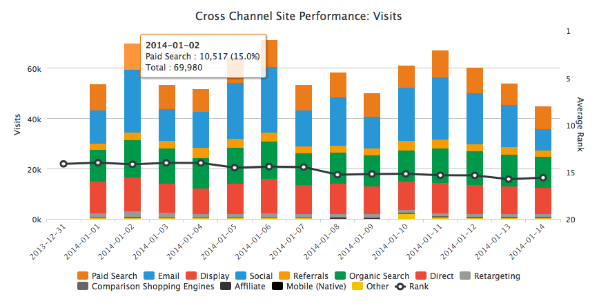
The chart and its sections are fully interactive as well as customizable, allowing both hover states and clickable sections for deeper dives into users data. Hovering over a section provides the total number of visits to content from that channel, as well as the percentage of total visits driven by that channel. Also displayed is the total number of visits on that particular day (week or month depending on the filter selected.)
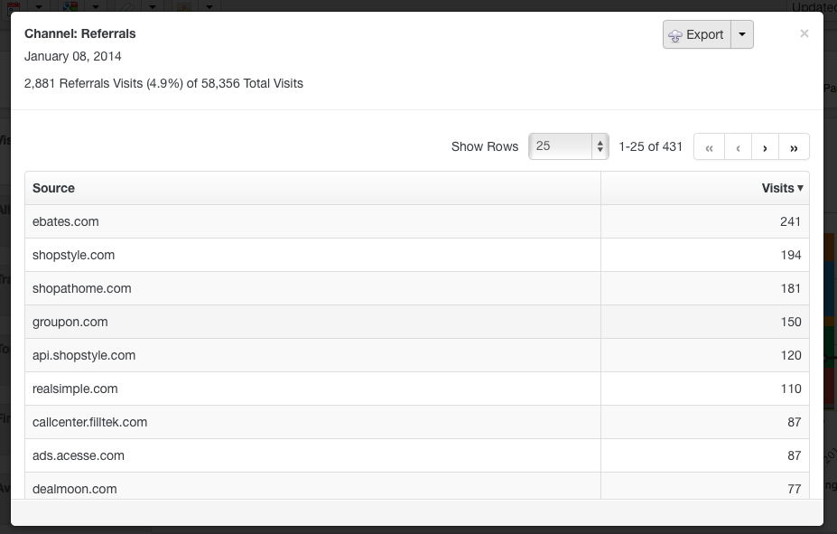
 Clicking into a section of the chart will open a pop-up window that breaks down the elements of that channel. For instance, clicking into Referrals, shows all referring sites as well as the total traffic for each referrer.
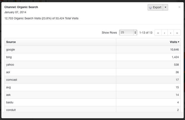
 Clicking into Organic Search provides a full list of the search engines driving traffic as well as their total visits.
Customize Your View
Users can also toggle various channels off and on by clicking on the channel name in the legend. Channels that are selected appear in grey in the legend and be turned back on by clicking.
 All charts can be exported to Excel or .csv file directly from the app for easy data downloads. Users can also add the Channel Performance Chart to automated reports, opting for daily, weekly or monthly sends with customizable header, logo, date ranges and views depending on report recipients.
This fully-integrated chart is built on a number of integrations and algorithms to provide the most complete view of how audiences are finding your brand. The chart’s goal of making it easier to measure marketing campaigns and KPIs through actionable data is the first of many steps GinzaMetrics will take this year to continue to build a superior content performance management platform.
Join us on Friday, March 28, for our FOUND Friday Google Hangout where we will talk about the update and the larger marketing technology landscape.
Read the Press Release