Google flips its approach to search indexing
Until recently, Google has indexed sites according to the desktop experience and content in the desktop version. Google didn’t consider mobile versions of websites in its rankings. Toward the end of 2016, Google made an announcement that it is moving to a mobile-first index “in the coming months.” In March 2017 at SMX West, Gary Illyes was asked what was delaying the mobile-first index launch. He suggested Google wants to maintain a “quality neutral” transition, and Google did not want search results to have a large impact from this launch. In June 2017, Google suggested change would likely be coming in 2018. At the very end of 2017, Google began to roll out this change to a few websites. Recently, Google began rolling out the mobile-first index to more sites that follow best practices for the mobile-first index.
What’s changing?
So, what exactly is a mobile-first index? Let’s take a look.
Today more than ever, users are searching on Google with a mobile device. Historically, Google search results have been calculated using the desktop version of a page’s content when calculating rank. This presents a problem in cases where there were differences in content between the mobile and desktop versions of a page.
[caption id=”attachment_856” align=”alignnone” width=”1024”] Image courtesy of: http://gs.statcounter.com/[/caption]
Noting the shift by users from desktop to mobile, Google is reworking how it calculates search results. Mobile-first indexing is exactly what it sounds like. Google is changing its search index to consider mobile versions of a site’s content first. Note that it’s not called a “mobile only index” - that means if you don’t have a mobile-friendly version your desktop version can still be indexed, but may be penalized in favor of a site that does have mobile-friendly content. Google is maintaining that when this rollout is complete, its search index will continue to be a single index. There will not be a separate index for mobile and desktop. However, during the rollout period, there will be mobile-first and desktop-first indexes.
How does mobile-first impact SEO?
This is clearly a big change by Google in its approach to calculating search ranking. How exactly is it going to impact search ranking for sites?
If you have a responsive or dynamic site already and your content and markup is the same for both mobile and desktop versions, not much will change for you. Google will simply start indexing the mobile version of your site first. Since your content and markup is the same, you should see very little change.
What could change is your SERP standings if there are currently content ranking above you that don’t have responsive sites. That’s right, you could see a bump as others take a hit. While this may not be a lasting impact, it is possible that some sites will see increased traffic through rankings as the mobile first approach shuffles existing content around the SERPs.
So, what does that mean for folks without a responsive site or who aren’t ready for mobile first? If you have a separate mobile site and it doesn’t have the same content and markup as the desktop version, it’s likely you will experience some changes in search rankings as a result of this announcement. Don’t freak out though. Google is far from finished with its rollout, and there are some straightforward changes that you can make to minimize the impact of this change.
How to prepare for a mobile-first index
Regardless of whether you have a responsive website or separate mobile and desktop site, you should head over to Google Search Console soon. Use the Fetch and Render tool and set the user-agent to “mobile:smartphone.” After the fetch and render is complete, take a look at the preview. What you see is likely what Google is seeing for its mobile indexing calculations. If you have a responsive website, you should notice very few, if any, differences in content. As previously mentioned, the rollout of mobile-first indexing will have minimal impact on responsive design sites.
If You Currently Have Separate Sites?
If you have separate desktop and mobile sites, you will probably notice some differences between the two. Google is making it clear that it wants you to accommodate mobile users. If you don’t already have a plan in place to move to a responsive design, it’s a good idea to start as soon as possible. This requires an investment of time and money and will not happen overnight. If you need assistance switching to a responsive design, let us know.
Content
The most important thing to do is to ensure that your primary content is on your mobile site. Google is being clear in it’s switch to looking at mobile first, and serving only a small portion of your content on a mobile site is detrimental to your site’s rank performance. This is specifically impactful for retailers who serve a separate mobile site that quickly load a lighter weight version of the thousands of product pages that they manage. Ensuring your primary content specifically, but all content as well, are on your site will minimize negative impacts.
Page Speed
We also know that mobile versions of sites are often slower than their desktop counterparts. Page speed is a long-standing consideration in Google rank calculations.

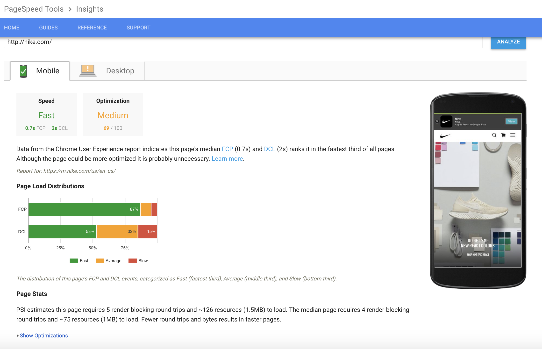
Don’t be caught with a site that can’t render content quickly - make sure your team is focused on delivering pages quickly. You can check the difference between mobile and desktop rendering using Google’s page speed analyzer. You can see mobile and desktop versions of page load distributions get page stats and see optimizations to improve your current score.
These tools from Google provide a free way to know where you stand now and where you need to be. If you get a low score, between 0-59, chances are you’re losing traffic and need to pay attention now.
Structured Data and Metadata
If you have separate URLs (or a m-dot URL for mobile), you want to check your structured data. Make sure your URLs in the structured data on the mobile site are updated to the mobile URLs. Google also suggests you make sure titles and meta descriptions are “equivalent” for both sites. It says “equivalent,” but making them identical works as well.
Robots.txt
Take a look at your robots.txt file. Make sure your robots.txt file works as intended for both versions of your site . In most cases, you’ll use the same robots.txt file for both mobile and desktop versions of your site.
Hreflang
If your site has an international component that uses rel=hreflang you need to ensure the hreflang annotations point to the mobile version of your country or language variants. (Desktop URLs should point to desktop versions.)
Social metadata
Your social metadata, including OpenGraphy tags and Twitter cards need to be included on the mobile version, as well as your desktop version.
Tabs and Accordion Menus
One interesting note about this change from desktop-first to mobile-first indexing revolves around tabs and accordion menus. Historically Google has been clear about not liking sites that “hide” content in tabs or accordion menus. Historically, for ranking purposes, it has not given full weight or ignored content it considers “hidden.” Because screen real estate is so precious on mobile sites, Google has been forced to backtrack on this practice. Moving forward, Google will consider content in tabs and accordion menus as content on page for ranking purposes. John Mueller has confirmed this change in approach.
Moving Forward With Mobile-First Indexing
Google has been talking about this change for a while now. Many have already made changes to accommodate Google’s shift to a mobile-first index. If you haven’t, don’t worry. This is an ongoing rollout and Google is only switching sites over that it determines are ready for the changes (for now). If you haven’t already adopted a responsive site design, this is a great time to make the transition.. If you have questions about how these changes can impact your site or need assistance getting on the right track, contact us.