A couple of months ago, we began to rewrite our entire reporting engine and improve on the type and manner of insights that we display in the Ginzametrics user interface. We’ve been gradually releasing this functionality over the last few months to get feedback from customers and to make ongoing improvements. I’m happy to announce today the addition of 3 new charts / reports that allow customers to track organic search visits, conversions and e-commerce revenue. These charts and reports are also aimed at improving your Findability Score, helping your brand get found by target audiences. I’ll provide some screenshots below of these new charts, but first I’m going to introduce the new reporting engine and provide an overview of all of the new reports released recently.
How the New Reporting Engine Works
In your Ginzametrics account, you can use the reports by going to your Site Dashboard > Reports tab. The idea of this screen is that all of the views on the screen are customizable by the filters at the top.
 We currently support the following filters / views of your rankings and analytics data:
- Date
- Granularity - Daily, Weekly, Monthly
- Search Engine
- Keyword Groups
- Conversion Event Type - directly mapped to your Google Analytics, SiteCatalyst, etc. Conversions
Ranking Distribution Chart
The first new chart we released was one we are most proud of because it looks great and it’s so useful for managing long tail SEO.
We built this chart in response to direct feedback from some of our best customers. The argument is that traditional metrics such as Average Rank lose their meaning very quickly when looking at aggregate data and this is particularly true for very large data sets (which applies to the majority of our customers). More useful is a view that shows how your keywords are distributed across the various positions on the SERPs. This becomes even more useful when you use our segmentation tools / filters (mentioned above) to slice your data.
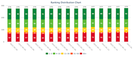 This becomes really useful for long tail SEO because it lets you focus on overall trends across larger numbers of keywords without getting too tied up in individual keyword performance.
Ranking Trend Chart
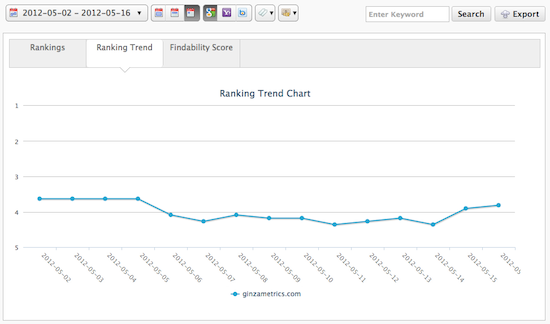
This is your standard ranking trend chart. :-) You can view trends for individual keywords as well by doing an exact match search (use quotes “”).
Findability Score Chart
The Findability (or Visibility) Score is a computed metric that we use to help you understand your overall ranking performance in the search engines. It’s a very simple calculation and has been used by a long time at various companies. Many of our customers were asking for this feature, so we’ve added it to our reports.
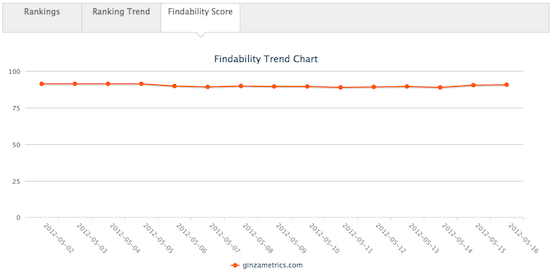 The way the metric works is, for each keyword, you can have up to 30 points (per search engine), based on your rank. So if you rank #1, you’ll get 30 points. If you rank #2, you’ll get 29 points and so on until you hit position #30. This score is computed across all of your keywords / search engines and then your points divided by the total number of points you could earn is calculated in order to derive your score, shown as a percentage. It turns out to be a nice, alternative way of looking at your performance.
The chart shows a trend of your findability performance over time.
Organic Visits Chart
The new charts we’re releasing today have to do with your analytics data (we support integrations with Google Analytics, Adobe SiteCatalyst, CoreMetrics, WebTrends and more). All 3 charts behave similarly and show you your core analytics data, broken down by the 3 major search engines in whatever market you are tracking.
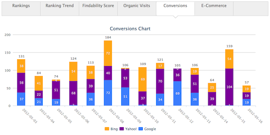
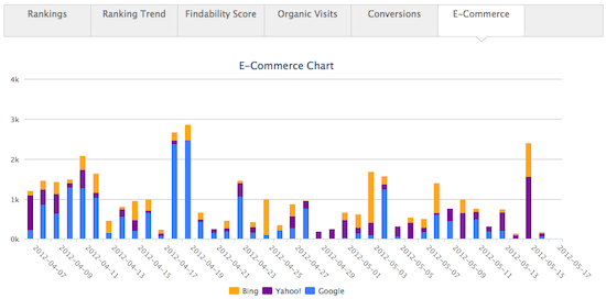
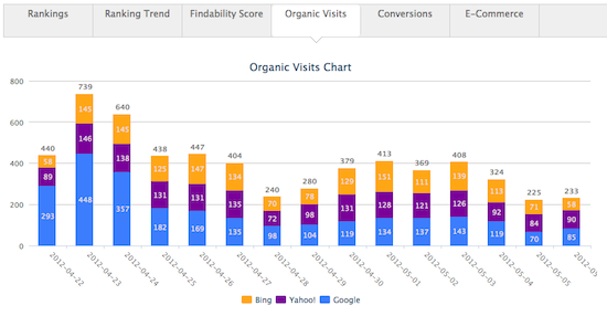 Below are the other two charts: conversions and e-commerce. The first thing you’ll notice is they all look similar – this is by design. They show the break down of traffic, conversions and e-commerce revenue by search engine.
Conversions Chart
The conversions chart shows the conversions that were completed from organic search traffic.
E-Commerce Revenue Chart
If you track e-commerce revenue in your analytics package, then this chart will be visible on the list of chart tabs. (You can enable this in your Site Settings > Advanced.) It shows the monetary amount of revenue on a daily basis, again segmented by search engine.
What’s Next
We’re close to rounding out many of the bigger features in our reporting dashboard, but we have a few more surprises on the way. Stay tuned and thanks again for using Ginzametrics!